Dr. Lam’s Art
 If you would like to see Dr. Lam’s daily artwork, follow him on Instagram @samlammd


“Enzo’s World”, Oil on Raymar Belgian Linen Panel, 16 x 20 in. This is a companion piece to the painting of my daughter of the same scale entitled “Ripples of Joy” that I completed last year. This project took me longer than usual, starting in mid-November, due to a protracted hiatus, as I worked on improving my health. (For my health journey, watch my 24-minute video on YouTube channel @samlammd entitled “How to be Healthy 2026”). The title of this painting harkens back to the Andrew Wyeth painting, “Christina’s World”, in 1948, which represents a starker view of solitude. Enzo, who is still silent, well at least not speaking yet, at 5 years of age is joyful and playful but has not spoken yet. I am waiting for God’s divine providence for that to happen, hopefully soon. This painting captures that enigmatic joy and silence on a playground with the reference photo taken in February 2025, so he has grown quite a bit since that image was captured. The technique employed incorporates elements of realism (not super realism) in the rendering of the main portrait and abstractions of the immediate foreground and background that reflect an Impressionistic style, which I love, creating a sort of Bokeh effect, if you will. I love the combination of relative realism and abstraction that makes the painting more interesting to me. I also love the color palette that renders a soft glow and warmth that reflects the emotions portrayed, especially the unbridled joy transmitted.


“Casa Grazia”, Oil on Raymar Belgian Linen Panel, 16 x 20 in. I have always wanted to paint a painting of my home, which I have referred to here by a name I have always wanted to call it but have never actually called it that. It simply means in Italian “House of Grace”, which I believe was given from above and symbolizes that we do not deserve anything in life but it has been given to us by grace alone. My home is no exception. I have always loved modern design and worked with my architect to design it exactly as I envisioned it down to every detail. I am happy to report my wife has accepted this painting to hang somewhere in our home but we have not decided exactly where yet. I love that the home is a plain white color, but the richness of the painting comes from the stark changes in value from left to right with encroaching trees overhanging it. I also adore how the trees frame the sides of the painting in a decorative and complex way. I decided to create a colorful and intricate sky since the painting otherwise would lack color. The lawn in front would have also been boring, but the shadow of the tree that is cast across the lawn makes a strong visual statement that frames the bottom half of the painting and also is composed of rich, variegated colors like Egyptian violet and extra pale jade mixed in with other greens, blues, purples, and browns to create a pulsating and colorful shadow.


“Mallorca Magic”, Oil on Raymar Belgian Linen Panel, 16 x 20 in. After creating a similar painting of my daughter, Alessandra, that hangs in one of my two consultation rooms at work, I decided to make a companion piece of Enzo from our time in Europe this summer for my other consultation room. We were on a catamaran in Mallorca, which was a day excursion from our cruise, when I snapped the reference photo of Enzo laughing incessantly from joy while sprawled out on a deck cushion. I knew I had to paint it when I captured this image. I wanted to go really big with the portrait, much bigger than the one I did of Alessandra even though they are both on the same panel size, that is, his face occupies a large percentage of the panel. I already planned at the outset to frame this painting with a bright orange and gold frame that I had custom made over a year ago. Accordingly, I chose a lot of incredible blues to complement the bright orange frame and to reflect the maritime theme. The blues also echo an unspoken masculinity. I chose Prussian blue, indigo, Sevres, King, turquoise, among many other blues all blended into a complex and gorgeous effect.


“Shell Game”, Oil on Linen Board (Oil-Primed, Raymar, Claessens Belgian Linen, C15SP), 16 x 20 in. This painting was inspired by a painting my sister did of my daughter Alessandra where she was holding shells near her ear, but I don’t think she actually painted the shells. As a family, we tend to collect various shells when we travel the world and label them as to the location and date of their acquisition. I also love to show Alessandra how to listen to the ocean by holding the shell close to her ear. Of course, the title of the painting has a double entendre of the old classic con man game of shells on the table, and in this case they are merely decorative in nature. For some reason, I have been wanting to paint seashells for a long time but hadn’t come up with a viable composition that piqued my interest. I used a family of colors that were very similar of purples, pinks, and browns that convey warmth, softness, femininity, and cohesiveness that I love. Big shout out to my wife, Ellie, for a keen and discerning eye to help me make critical corrections of the portrait to match the reference photo more faithfully. The frame for the painting has been sitting in the corner of my room for a long time, not having found the occasion to use it. The frame was custom made for me by one of the most spectacular custom framemakers around, Karol Milewski from Poland. Thank you for the gorgeous work that supports and enhances my work.


“Saving Hope”, 48 x 48 in., Oil & Acrylic Paint; Oil Sticks; Spray Paint; Gold, Copper, and Silver Leaf; Molding Gel; Resin; Mica Powder; Baking Soda; Glitter Glue; Airbrush Paint; Metallic Markers. This painting using multimedia materials was created as the third piece in my “Hope” Series, which will be donated for auction this Fall to the Dallas Children’s Advocacy Center (DCAC)’s Art for Advocacy event. The title comes from the idea of rescuing children from their plight, which is the mission of DCAC, and modeled using animals to display loving care that parental animals show their babies. The title also comes from the animal rescue charity of the same name that Ellie and I support who helped us nurse Lucky, our rescue dog, back to health whom Ellie saved from the side of the highway, who was run over by a car, and who had been abandoned by her owner. I really had a lot of fun incorporating the various elements of this painting and working with slightly more abstracted renderings than from my more rigidly detailed prior figurations in the last two “Hope” canvases. The colorful expressivity and sense of motion work well to symbolize the active emotion that this painting is trying to convey.
Super excited to be a part of Empty Bowls and to donate an artisan’s bowl (my first-ever ceramic work) that was selected for auction (a handful gets chosen) to help feed the hungry. The event will be held April 24 and you can get tickets as little as $35 for the event where you get a smaller bowl than I created and you will be able to bid on the one I made. My bowl is called “James 2:15-16” in honor of verses that reflect how we should help our brothers and sisters in need. This first effort of mine features a complex peony flower with a garland of leaves and tiny peonies encircle it.


“We are home”, Oil on panel, 12 x 16 in. This is my second portrait of my entire family. The first one featured microscopic head sizes and posed its on set of challenges because of the miniature size constraints. I wanted to undertake this portrait because to me the hardest thing to do is not a single portraiture but a multiple portraiture due to ensuring head sizes are comparable, lighting matches, and skin tones work in harmony, not to mention making sure all four heads are life-like and representative of each of us. The reference photo was taken in Panama (my second painting of our time in the country of Panama) when we visited the Embera tribe, an indigenous people in Panama, who live simple lives uncomplicated by modern technology like our own. The title of the painting comes from the idea that when we are all together we are always home no matter where we may be traveling. The background (like my last Panama painting) is abstracted, almost impressionistic, to serve like a blurred, photographic backdrop and also to de-emphasize it and to contrast it with the more realistic foreground. The painting was composed using three reference photos to make sure the kids’ expressions were ideal along with a separate one of the background, which looked overexposed by my camera when photographed with the foreground subjects. I am not happy with the frame I had made and am looking to get a suitable frame for this painting and feel compelled in 1-2 months to varnish the painting with a satin finish to deepen the color saturation when the oil dries down. Still debating that idea.

“Panama”, Oil on Panel, 5 x 5 in. I was inspired to paint this small painting when Ellie was getting a temporary tribal tattoo in the Ebera village in Panama during our recent family trip there last week. The lighting from the outside into the hut was really optimal as she sat at the edge of the hut. This simple painting captures a sense of peace in her mood. I really like the darker, realistic tone of the portrait juxtaposed with the wild, impressionistic, bright brushstrokes of the background. The portrait photographs much darker than the actual painting, and I cannot fix that in my photo. The lush skin tones are also not translated into the photograph. The abstract background is meant to convey a photographic blur but also to be reminiscent of a Gauguin type of Impressionistic/post-Impressionistic landscape and the wild quality of nature. I really decided to paint this small panel because I am waiting for my imprimatura to dry on a larger portrait I am about to work on. This painting will be housed in a simple black frame that will sit on a table just like a photograph would.


“Lucky”, Oil on panel, 6 x 6 in. This small painting of our dog Lucky is set against a swirl of pinkish purple that I believe complements her feminine and delicate disposition well. In addition, her coat naturally exhibits tinges of purples and pink, especially evident around her nose, mouth, and backside. I have used a similar background when painting the other ladies in my family, Ellie and Alessandra. Lucky came into our family through an act of charity when Ellie rescued the dog seeing her in the street after being run over by a car because her previous owner had abandoned her on the highway. Our family nursed her back to health with the intention of offering her up for adoption, but apparently God had other plans, so she is now a part of our family. Thank you to Saving Hope Charity and the families at The Compass School of Texas for helping us carry some of the burden of our expenses for her convalescence. It was particularly difficult to capture the reference photo because she is always darting around, most likely still some fear in her from her prior life. This painting will accompany a larger portrait of our other dog Kenji that I painted on copper a little over a year ago.


“Compass Floris”, Oil on Canvas, 48 x 48 in. Compass Floris is part of my Floris series in which hyper-charged, realistic, colorful flowers are arranged in abstract, geometric patterns and beautifully contrasted against black. This painting took me several months and over 100 hours to complete and will be auctioned on March 1, 2025, for the Compass School of Texas. 77 flowers featuring a predominance of peonies and roses, which are among my favorite flowers, are designed as a compass with compass flowers extending upwards through true north. There are 36 flowers in the outer circle, 12 in the middle circle, and 7 in the inner circle with three rings of flowers in total. The four main cardinal directions are created by cherry blossoms as a tribute to my daughter, Alessandra Sakura Lam, as her middle name means cherry blossom in Japanese. The ordinal directions feature more diminutive cherry blossoms, and the secondary intercardinal directions (NNE, SSW, etc.) are formed by highly abstracted and colorful vines. Please reach out for floral painting commissions ranging from $50-75k depending on size and complexity.


“Kaleidoscope”, 48 x 30 in., oil and venetian plaster on canvas.
This abstract piece was commissioned by my parents who wanted something colorful and fully abstract for their home. The kaleidoscopic colors are inspired by Italian mosaics (mosaici) and Missoni textile sweater prints. I love the wave of colors and how I segregated them into different sections from coolish to warmish to neutrals. The Venetian plaster was a tough surface to get right. It kept cracking, so I had to finally gesso over it after multiple failed layers to smooth it out. I wanted it to be sculptural in its relief. This painting will go on a narrow wall between their living area and kitchen and serve as a centerpiece of their home. It was originally painted in landscape orientation but will be displayed vertically in portrait orientation to better fit the desired location.


“Love Beyond Measure”, Oil on Panel, Diptych, 9 in. Tondos.
I already had purchased these gilded Tabernacle frames last year in preparation for two portraits that would go on a buffet in my dining room. I thought it would be interesting to have these paintings stand on a table rather than be hung on a wall, just as we would do with our family photographs. I love too how the gold frame adds a saintly halo quality to the subjects, my children. I took out all distractions from these portraits in terms of backgrounds and clothing with a pure focus on the facial features, each child showing a very different expression, Alessandra with a knowing smile and Enzo with an exuberant burst of joy on his face.


“Hero”, 48 x 48 in., Oil on Canvas.
This painting I undertook as a contribution to my friend Sumit Rai’s charitable 501(c)(3), saveafirefighter.com. Sumit has created the most amazing technology to detect cancer with near 100% accuracy using a simple blood draw evaluating whole cells in their entirety through circulating tumor cell capture without the inaccuracies of amplified DNA used by other technologies that do not work well. They can and have detected circulating tumor cells in Stage 0 cancer. Check out cancerchecklabs.com. Joe Rogan just featured a conversation about their test capabilities! He will be changing how we detect cancer and I am confident will cure cancer in the not-so-distant future. His charity will donate millions of dollars of free screenings for firefighters who have a higher chance of multiple cancers due to their hazardous exposure to workplace chemicals. I am honored to be able to donate this painting to such a worthy cause.This painting represents the heroism of the firefighters who work to save our lives in a selfless way. There are 7 holy doves representing goodness and purity, 7 eagles representing bravery, and 7 swallows representing healing. There are three main circles and three sets of 7 birds, which are also divine numbers. There is a middle circle of 12 fire poppies, which are rare flowers that regrow after a fire and reflect the warmth and glow of a fire. The central flower is a fire lily that also regrows after a fire. I also tried to capture the ring of smoke on the outer circle and a mixture of smoke and light in the inner circle. I love how the color palette is kept purposefully restrained and dramatically set against the black gesso background, representing the darkness that the firefighters fight against.


“Hope Blooms”, Acrylic & Oil on Canvas, 120 x 60 in.
Dr. Lam has been involved with the Dallas Children’s Advocacy Center (DCAC) now for a few years. He and his wife Ellie served as honorary chairs 3 years ago and he has been contributing his artwork every year. The first year he listed his artwork to the silent auction it sold out in minutes at top bid of $20,000. In his second year (last year), his piece, Hope Eternal, closed the live auction with a record-breaking sale of $46,000, where the buyer donated the painting back to DCAC to be used daily as a tool for children’s therapies. DCAC is an organization that works to help children who are abused to escape their predators, to rehabilitate them, and also to prosecute those who have committed this horrendous crime. All of the proceeds from the sale of the art work goes straight to the children in need with none going to administrative overhead. This year, Dr. Lam’s painting, Hope Blooms, coincides happily again with the theme of the event, Hope Blooms, without his even knowing that at the time he began work on his piece. Like last year, he has enlisted the help of the children who are the recipients of the proceeds of the sale of the painting. This year many of the children who participated in painting were “Priority One”, meaning they were in such dire straits that they were pulled out of their situation without even a caregiver assigned yet. Despite this horrible situation, they painted words of hope and love. Dr. Lam’s vision was to have them paint with their fingers more representational images and words to make the contact with the canvas more meaningful and intimate. He then used those words and images to create a complementary pairing to the children’s work. He devoted over 200 hours and 5 months of time to complete this large-scale project.


“Floris IV”, Oil on Panel, 36 x 36 in. This is the fourth painting of flowers on a black background. The first one now hangs in my home in my second master. The second one sold at auction for $20,000 (max bid) for charity at the Dallas Children’s Advocacy Center Art for Advocacy event two years ago, and the third one was composed of two intimate panels of two flowers that I gifted my mom. This painting’s journey began when I saw this gorgeous fluorescent pink frame by Kurian frame with an unfinished wood edge that I knew would make an exciting frame for almost any project. I needed a 3 x 3 foot painting for my walk-in closet to divide Ellie and my side of the closet, which I have been planning for a couple of years now with completed paintings decidedly going elsewhere. I believe this one will finally reach its targeted home. Initially, I was going to do a complex painting of flowers and ethereal animals in a labyrinthine design in a nocturnal setting. Then, I got out my art compass and made a few circular strokes on the panel and a bull’s eye design of flowers immediately came into focus. I abandoned my initial plan and really love the end product of this work that took one month to complete with approximately 70 flowers. I have always been captivated by flowers and modern design, and I think this painting goes a long way in marrying these two elements. The inner circle is composed of medium-sized flowers; the center, tiny flowers; and the outer ring, large flowers. I encircled the inner ring with hyper-real cadmium-green vines, made the middle circle composed of wooden branches, and the outer ring with a mixture of both vines and branches. I have always put a peony in the middle of my Floris compositions but decided it lacked the symmetrical force and color saturation of a sunflower, so left the peony only as a peripheral element. At the end I decided to add a little complexity and intrigue by adding some animals like a hummingbird, a lady bug, a bee, a grasshopper, a caterpillar, and a dragonfly into the flow of the outer circle in a symmetrical distribution. I am truly looking forward to seeing this painting every day as I leave and return from work.


“Solace”, Oil on canvas, 60 x 60 in. This painting was inspired by perusing some of Andrew Gifford’s work on Instagram. I wanted to make a bold, big impressionistic landscape on a large-scale that was filled with complex green shades and subtle pops of intense pinks, yellows, oranges, purples, and other colors. I started with a reference photo that gave me the basic structure but greatly departed from the original photo in terms of color choices and composition, especially the ground. I have already purchased a large, black, wooden floater frame that will accommodate my 2-inch deep canvas. I will need to decide with Ellie where this painting will go in the home. Many options!


“Together in Tulum”, Oil on Panel, 12 x 16 in. This painting represents the third painting of my time in Tulum over Christmas holiday last year. I knew at the outset the difficulty of creating this painting for so many reasons. First and foremost, the sizes of the heads are so tiny, less than the size of my index finger each, which made it very difficult to paint. The brushes I use are incredibly small, but in many cases I could not even paint the eyes because the brushes were not small enough. I had to push the paint around to make the eye shape correct. In addition, it was really difficult to make the likenesses of the heads correct given their tiny size. I had to repaint my own face multiple times to get it right. Second, having four heads, that is, four portraits, further made this painting more difficult. Third, the complexity of the elements overlapping also made it challenging. Finally, the elaborate background was the final level of difficulty, which actually turned out to the be the easiest task to accomplish. It took me 6 days to complete the foreground portraits and only one day to execute the background. The painting will be framed in a Dutch ripple frame custom designed for me by Ripple Molding, into which I will insert it when the painting sufficiently dries. I love the colors of the painting, again using my favorite colors Alpine Green Extra Pale and Cadmium Green Light, which marks the fourth consecutive oil painting that I have used these colors by Vasari. I was also able to use my Cobalt Teal Greenish, another favorite color. I believe this is the first painting where I have painted all four of my family members in a single combined portrait.

“Manet in Tulum”, Oil on Panel, 5 x 7 in. This is my fourth and final painting from my time in Tulum, Mexico. It is inspired by Manet and by an artist I follow on Instagram Serge Marshennikov. I love to work on interesting skin tones and shadowing and used multiple layers of rich colors to create the back. I kept the surrounding palette very neutral with only browns and blacks as a point of contrast, using multiple types of blacks that would have warmer and cooler hues to add complexity along with multiple layers of glazing. The door in the background is principally Mars Orange, an opaque color that adds weight and density and contrasts with the more neutral browns of the curtain to the left. This small painting will be cradled in a gorgeous frame made by Northwood Framing of England.


“Tulum”, Oil on linen panel (Raymar Artfix L64C Belgian linen), 10 x 10 in. This painting was undertaken en plein air, that is, painted outdoors looking at a live scene, something that I have wanted to do for quite some time but needed the gear to make it a reality. I was quite ambitious to undertake my first plein air painting in a different country in Mexico where we are vacationing over the Christmas holiday. I had to pack a ton of oil paint tubes, my Masterson palette box, my Alla Prima carrier (to carry wet oil paintings back home), and my brushes. I used cooking oil, paper towels, and detergent to clean my brushes on site. I did not want to tote down my new plein air easel, so I jerry-rigged an easel using two new toilet seats taped onto a stepstool placed on top of a stool. It worked like a charm. Perfect height for both standing and sitting (mostly standing) and quite stable, allowing me to bring the painting inside after each session. Having continued to be inspired by the Pierre Bonnard exhibit I recently saw, I used highly saturated colors but worked hard to make sure that the colors would 1) have representational meaning 2) not be simply bright for brightness’ sake, as I wanted to show some level of restraint with their use. I think the bright colors also really capture the mood and spirit of Tulum specifically and Mexico in general and will serve as a reminder to me about our trip. I also love to paint pools and water, and this painting reminds me of a David Hockney painting as well. I used the Alpine Green Extra Pale that I just bought for most of the pool, which has become my new favorite color, as I used it on my last painting I completed a few days ago in Dallas, “Self Portrait”. I used a very thin veneer in my last painting, so it looks totally different if you compare how both paintings look. The scene I painted was the pool just outside our master bedroom at our AirBnB, which was a totally fascinating home. Villa Camila is a modern four-story home, made entirely of concrete, with three trees growing inside from the first floor up through the floor all the way through the roof. There are two pools, one on the ground level and one on the fourth floor where there is also a large nest overlooking the neighborhood. I was debating whether to add any figures like a child or a dog but decided against it since the solitude of the enclosed pool and garden would have been disrupted by the presence of live figures. One thing that was really cool was painting en plein air, and doing this painting at various times of the day over two days was that I was able to take the best lighting from each time I painted, so the shadows are probably not as realistic but will be more reminiscent of a de Chirico painting. For example, the shadows on the wall behind the plants occurred in the morning hours but the shadows on the side walls occurred in the evening hours. I put both of them into this painting. I really enjoyed this loose, fast, impressionistic painting, completed in two days on vacation. I love Raymar panels and use various types. This one is a super-fine Belgian linen that is double sized and quadruple oil primed for added bite and absorbency. I usually like a more textural linen but this smoother one was quite perfect for the scale of this painting, as a stronger texture may have overpowered the delicacy of this work.


“Self Portrait”, Oil on panel, 5 x 5 in. This tiny painting follows as my third painting of this dimension in a row but that departs from the overt portraitures that I have been engaging in recently. I wanted to explore a still life subject, which I thought would perfectly suit the small size of this painting. The last time I painted a subject like that was a year ago, but like in that painting and in this one I always find a way to squeeze in a portrait. Hence, the cheeky title of the painting. If you look closely at the center of it, you will see me with an easel painting this scene reflected off of a silver orb. I was partly inspired with the concept of the hidden portrait by the recent exhibit I saw of Pierre Bonnard at the Kimbell last week. This month’s paint sale at Vasari (my favorite oil paint) is green, and my order arrived minutes before I was deciding on what to paint the background, and I believe it was perfect for this painting and really made it pop. The cadmium green light background is stunning and pushed all the way to the top of the painting makes the work beautifully framed by this highlight. Further, the alpine green extra pale looks stunning washed gently as the foundation of the table. I only painted all of the objects with a single pass without touch ups, refinements, or glazing. The entire work was completed in two days. I may go back and do touch ups but I need to resist the temptation to do so since I love the rawness of this painting and the Cezanne feel to it. I have always loved the tension between abstraction and realism with most of my paintings falling somewhere between these two extremes to varying degrees. Of course, the rendering is realistic but I have kept the painting with minimal levels of additional detail to keep it at once flatter but still quite dimensional due to good shading techniques. I have left minor cracks of black along the borders of some of the objects that render this painting less realistic and blockier that to me makes the final product more interesting, stronger, and again in my opinion (perhaps you would disagree) like Cezanne (yes, my apple is more realistic than his). The green background is painted with the brush strokes still partly exposed and I have declined to refine the painterly strokes throughout the painting. The apple and flower symbolize beauty (external) and health (inward) and serve as memento mori as an homage to the academic tradition of still life paintings. You can also see my painting of one of my paintings, which I love to do, also reflected in the orb. This painting will also be housed in a gorgeous, gilded Dutch ripple frame by Northwood Framing of England, which I cannot wait to receive.


“The Winnowing Wind”, Oil on panel, 5 x 5 in. This painting accompanies the one that I just finished of Alessandra in a bubble bath and will be displayed in a gorgeous ripple frame designed and constructed by Northwood Framing of England but that will be uniquely different but similar to the one that will house the painting of Alessandra. The title of the painting comes from a line from the poem “To Autumn” by one of my favorite poets John Keats, and I would encourage a read of the poem if you have a few moments and then look at this painting after you read it. In the poem, Autumn represents growth and maturation, which is a foreshadowing and desire for Enzo as he continues to develop into a man. I am thankful for our nanny Becky who has a degree in photography and who captured the reference image that has marvelous emotion, light contrast, and motion of the leaves encircling Enzo. One of the most striking elements of this painting is the background painted in interference blue, captured better in video and in various angled photos of the painting. I was inspired by a recent Instagram post by an artist showing this paint, which I owned in my collection of oil paints and never really knew how to use it. However, I have used interference acrylic paint before, and a large canvas sits right outside the door where I am composing these words. Interference paint is quite unique in that the lighter the amount placed the darker and bluer the color is as well as the degree of intensity of the iridescent sheen; whereas, the heavier that it is applied, the whiter it appears. It also picks up the underlying tones of the background, which in this case is a toned down black. The little eddies of white in the blue look like clouds to me. I also like how the light application of the paint mixed with the background tree and leaves diffuses and blurs those elements making the painting appear photographic (like portrait mode) and separates the foreground more strikingly than anything else I could have done. I wanted the background to be in lower value (darker) than the front to make the foreground pop but I wanted it to be complex and interesting in its own right like the bubbles in Alessandra’s bath. The impressionistic diffusion of paint in the background also reminds me of the exhibit I just saw of Bonnard last weekend, rendering the background simultaneously like an impressionistic painting and making the foreground more photographic at once. I hope you enjoy this small painting as much as I do.


“Le Sirenuse”, Oil on panel, 5 x 5 in. This fun, small painting (with the tiniest dimension I have ever painted) started with my purchasing a gorgeous, diminutive Dutch ripple Dahlia frame with a gilt edge from Northwood Framing of England and wanting to make a miniature portrait that would fit it (frame will not arrive for many weeks), and I will be doing one of Enzo shortly with a similar yet different ripple frame also purchased from them of the same dimensions. I noticed that Alessandra looked particularly adorable at the end of bath time when she refused to exit the bath, lingering in the bubble bath clutching her mermaid Barbie doll. I had done a pastel series of the children called “Bath Time” a year ago, which unfortunately I can no longer undertake due to allergies to pastel dust. I also relished the challenge of painting realistic bubbles and foam, which I accomplished by zooming in and out of the reference photograph and repeatedly increasing and decreasing the values of each tiny bubble. The title of the painting comes from a famous and gorgeous hotel in Positano, Italy, named after the neighboring islands of the same name. These islands were inhabited in legend by mermaids, or sirens, the word in French and Italian for mermaids. Initially, the sirens were depicted as having the head of a human and the body of a bird (hence the name, li galli, “the cocks”, the other name for these islands) but transformed sometime around the medieval era into their current conception of a human head with a fish body and tail. When I saw the hotel of the same name, I initially thought it was a French word (masculine, singular) but it is actually an Italian word (feminine, plural) for sirens (although the normal way of referring to them in Italian is le sirene). I entitled the painting this fanciful title since Alessandra is my mermaid and she is floating in the seafoam water (of her bathtub) with a mermaid Barbie. Also, I love Italy and love that hotel, even though I have only toured it when I was there and have not stayed there yet, so I am hoping that I will think of Italy and that hotel when I look at this painting.


“Collige, Virgo, Rosas”, oil on panel, 8 x 8 in. The title comes from the poem by the Latin poet Ausonius (c.310-395), repeated in the 17th century in the collected poems Hesperides by Herrick, and then used again elsewhere in popular culture like in the film Dead Poet’s Society where Robin Williams quotes a variation penned by Walt Whitman. The full phrase in Latin is “Collige, virgo, rosas, dum flos novus et nova pubes, / et memor esto aevum sic properare tuum,” which translates as “Maidens, gather roses, while blooms are fresh and youth is fresh, and be mindful that your lifetime hastes away.” I chose the title because it is a three-word Latin phrase to match my last painting “Dei Gratia Regina” that I also just painted of Ellie. The last painting was done in a serious and detailed fashion where this one is clearly more impressionistic and fun with wildly crazy colors. The painting’s title was also selected for multiple, layered meanings. As you see, the exuberant colors used in the painting harken to show a pastoral and idyllic setting that is reflected in the poem’s lines. Second, the poem talks about the temporal nature of beauty like flowers but there is a hidden meaning in the poem that promotes marriage and spiritual union. The roses and doves in the background symbolize this duality between physical beauty and spiritual purity, two elements that I am trying to capture in both the foreground image of Ellie and the background elements that support the foreground. The foreground and background are linked by branches that evolve into hairs. The painting includes my three favorite elements: portraits, birds, and flowers. I also used an impasto technique (thickly applied paint) probably for the first time at least in the medium of oil. The poem talks about the fleeting nature of physical beauty, but I like the element of an eternal beauty of spiritual submission, symbolized by the doves. This painting was particularly difficult to execute in that I had to really focus on value (light and dark) and color temperature (warmth and cold) in my colors to make the painting work since the color accuracy of flesh and hair tones was not an objective and actually undesirable in this case. I pulled this painting many times from the brink of disaster. With multiple layers, colors can get muddy and most of it was initially done alla prima (that is, entirely wet), so I had to let some colors dry down a bit before layering so that I could restore chromatic purity. The painting will be housed in a gorgeous Dutch ripple, gilded frame custom built for me (shown in this post) by Northwood Framing (northwoodframing.com) from England. I cannot wait to receive the frame in the coming weeks.


“By Your Side”, Oil on panel, 9 x 12 in. My mom Carol has been asking me to do a painting of my two kids walking hand in hand away from the viewer, that is, just their backs, after she saw an abstract painting of two children in the same pose in a gallery in Toronto. My nanny Becky actually has an undergraduate degree in photography, and she was kind enough to take the reference photo of my two kids in our backyard. She really captured the emotion behind this simple gesture where Enzo is leading Alessandra to the playground. I wanted to create a painting that combined a somewhat realistic foreground of the two children so that you could easily identify that it was my two kids even though it was from the backside alongside an impressionistic background filled with color since my mom loves bright colors, as I do. By making the background impressionistic with loose gestures I think I created a wonderful juxtaposition of two styles that work well together in a complementary fashion. I have already ordered a simple white wood floater frame that my mom approved, as she is very particular about what she wants. She said she loves it, which makes me happy!


“Sleeping Beauties”, oil on panel, 6 x 8 in. This tiny painting was inspired when I saw my son Enzo asleep in the upstairs living room floor with the afternoon light bathing his skin tones. I had my daughter Alessandra pose being asleep, which I then flipped the photo to make the composition work and joined the two images into one for this painting. I purchased a custom frame that I love from Batican, an American who learned his trade in Florence, Italy. The frame which features an Arched Flemish Corner design with a pale gold frame really intrigued me and reminded me of the old Flemish Renaissance paintings and will truly make this painting even more intriguing to look at. This painting took me a day to complete, as compared with my last massive painting that I just finished, the Hero & The Princess, that took over 3 months to do so. I cannot wait for the paint to dry so that I can put it in its lovely custom frame!


“The Hero & The Princess”, oil on canvas, 48 x 72. in. This painting features my daughter Alessandra, my princess, on the right side with all of her favorite characters and my son Enzo, my hero, on the left side with all of his favorite cartoon characters. My daughter guided me on most of the selections she wanted, including having her best friend Carver featured, whom I turned into a mermaid. This painting took over 3 months to complete and will hang in my son’s room for him hopefully to enjoy every day since he is transfixed by the art in our home that I have created, and I also hope that Alessandra will continue to enjoy it since she always asks to come to my art studio to check out the progress of the painting. I am going to miss taking her every day to my studio to show her what daddy painted for her that day. I really enjoyed the challenge of making fanciful portraits that seamlessly and creatively blended with the surrounding comic and cartoon characters who are of various levels of realism from portrait to simple flat figures. I really love using the cloud motif to bind and blend various elements together, which also allowed me to feature a lot of sumptuous colors that I truly love. I have also already purchased a large white floater frame that will arrive soon.


“Hope”, oil on Belgian linen panel, 12 x 12 in. panels, triptych. This more intimate painting follows my very large 10 ft. canvas “Hope Eternal” for DCAC. Enzo, Alessandra, and Kenji will be hung next to a portrait of Ellie and me I did a few years ago and wow what an evolution I’ve experienced over the last 2-3 years. My skin tones look so much more complex and realistic. After drying and framing, these portraits will be at my office in the newer wing along the main corridor left to the entrance of my hair transplant operatory.


“Hope Eternal”, 120 x 60 in. (10 x 5 ft.), two panels, oil and acrylic on canvas. The background was lovingly painted by the children of the Dallas Children’s Advocacy Center (DCAC), of which I was honorary chair with Ellie last year for their Art for Advocacy event and to which this painting will be donated for the same event this year. This project has been one of my most ambitious in scale, effort, and creativity, which took me 3 months and over 200 hours to complete and just made it for deadline today, June 15, to be considered for NorthPark viewing. The funny thing is that I had already conceived this project a year ago with the title in mind and did not know that this year’s theme was “Hope” with the tag line “Paint me a picture of Hope”, so it is quite fitting that my painting captures the idea of hope. Birds and flowers are the central theme that encircle the children and serve as touch points of hope. If people do not know about DCAC, it is a charity committed to help children who have been abused in all different ways and is there to serve to stop this horrible crime and to bring those to justice who perpetrate it and to heal those who have suffered from it. I am honored to donate this piece that can be hung as two companion pieces or as a combined diptych. The painting includes two young children that I have altered from the references to make them exactly how I want them to appear along with 65 birds, 35 animals, 135 flowers, and a lot of fruits, leaves, and other elements. I love how this painting combines the abstract elements from the children and figurative elements that I made, which I worked to make sure that I could incorporate their freestyling abstractions tied into my representational portions. For example, I made their bluish areas on the bottom into ponds and other swirls into areas where clouds breakthrough them. I am hoping to raise a substantial amount on behalf of this charity. The event will be held Saturday, September 16, 2023. For ticket information or for donating opportunities, please PM me.
-
Above It All


“Above It All”, Oil on Belgian Linen Panel, 18 x 24 in. This painting takes its name from a double entendre, of course, not only being physically high up, but also because Ellie is doing a great job with raising our children and being “above it all” with every life circumstance. I just wanted to commend her on her excellent parenting and staying above the fray in making sure our children are well taken care of. The painting composition was inspired by Alex Kasyan who did a painting of a woman on a terrace in front of a cityscape, which I thought would be a very challenging and interesting subject. I have never painted a cityscape and wanted to see if I could do it with about 95% of the buildings done free hand with no taping. If you did not figure it out, this is a cityscape of downtown Dallas. I do not know from which building the reference photo was taken but I created my own imagined building that does not exist in reality. Getting the proportions right of this imagined building was difficult and I had never painted a large panel of glass before. Fortunately, I had purchased a clear non-toxic gel medium, Rublev’s Oleogel, which had great reviews for my last painting but never wound up using it until now. It was perfect when mixed with whites, light blues, and transparent blacks to make the sheen of the window pane without knocking down too much detail of the buildings. Even though it is a classic terrace, I wanted to have a modern railing because I chose not to have any metal obstruct or bisect the cityscape. As you can see, Ellie’s figure on the left and the wall on the right along with the terrace below serve as framing elements to focus your attention on the central element of the cityscape with the Plaza building essentially centered between these elements. I used slightly surreal colors to show the warmth of the afternoon sun and because I love colors. Even the dress that serves as a cool color element on the left where there is a predominance of shadow is entirely imagined from pieces of different dresses I found on the internet. Hope you enjoy!


Kenji on Copper”, oil on copper, 16 x 16 in. This is my first painting of my new dog Kenji whom I have had for the past year and who looks uncannily like my prior dog Kumo whom I have painted in almost every medium. This is also the first time that I have painted on copper, which I have wanted to do for quite awhile. Copper is a classic substrate that was a choice of many Renaissance painters like Raphael and Da Vinci due to its luminous qualities. I kept the background entirely raw so that you could truly see the brilliance of its natural color. The first layer was really tough because the paint does not bleed into the surface as it does into gesso. By the second layer, everything returns to normal, but I was prepared for that after doing a lot of reading about copper before starting the painting. I was initially going to do Kenji on a brown Corbusier chair to make the entire painting tone on tone browns and oranges but realized that I couldn’t communicate the emotion of the face or the detail of the fur, so I decided on a closeup of his face. In general, I do not like to make a photorealistic painting but prefer instead to give my own interpretation to a painting by staying somewhat between realism and abstraction. However, in this case, I decided to add 7 to 8 layers of details to make it close to photorealism because I knew that with the simple composition, there were going to be only two elements to make it visually engaging: the shiny copper background and the level of detail of the execution. It was a joy to paint the level of detail into this painting. The frame that I have custom made for this piece is really interesting with beveled edges, and I will post it when I finally have it completed.


“Luminosity”, Oil on Panel, 14 x 14 in. This painting has been in my creative mind for over a year germinating. I couldn’t think of how to execute on it. Originally, it was going to be a wide format painting when Enzo was still crawling. But it just didn’t feel right. I turned that canvas panel into an English garden instead. I received this frame as a gift to try out a new series of floater frames and I thought the square format would be perfect to capture both Enzo and Alessandra. We recently returned from a cruise in December and I captured a great photo of Alessandra in the Bahamas and on the previous day Enzo in Tortola, BVI. I thought that combining both of them would be ideal. I reversed the reference photo of Alessandra to get the lighting and shadows to match Enzo. I worked to get the proportions of two of them to make sense in the same frame. I was inspired by the color choices by the London-based artist Victoria Obolensky’s seascapes in terms of the sky colors and some of the foamy waves. It was interesting how distorting a photograph really is, and I had to adjust proportions on Enzo due to the distorting lens of the camera to make the painting look right. When I started to add beautiful colors to Enzo’s chest of Montserrat orange and orchid to capture and tie in the colors of the sky, I really got excited and redid all of the flesh tones for both of them. There was a void on the bottom left, so I added crashing waves and rocks to increase visual intrigue and to become a third element of interest in the portrait. The four rocks also represent the four members of my family. Look carefully and you will see the rocks and up churned sand under the water on the bottom left to hint at the shoreline. The title of the painting comes from the liminal glow of light at the end of the day, as I find this light more interesting than broad daylight, when the reference photos were taken. I am at heart a colorist and wanted the saturated colors to really make this painting pop, and the imagined end of day light helped me achieve that goal. The color rendering is a bit impressionistic, as I do not want to try to achieve photorealism but to guide the viewer toward an appreciation for a painted work that may not truly exist in reality. Luminosity also represents the brightness that these two kids have in my life.


“Les Arcs de Triomphe”, Acrylic & Oil on Panel, 26.5 in. diameter tondo. This tondo was going to be a portrait of Enzo but after finishing the square piece “Arcs + Stripes Forever”, I couldn’t resist doing one more abstract piece. The title obviously comes from my Francophilia and the monument in Paris. I wanted to do all arcs with no stripes for this round panel to highlight the roundness of the panel’s shape. Also, as I finished making all the stripes, I realized that the painting simply did not have enough complexity, so I knew that adding amazing shadows would take it to another level. Looking at a photograph of some black tape that I had still on the panel, I realized that the shadow should be cast at a distance from the original lines unlike my previous painting, which would have made the previous painting way too busy. These shadows not only would add depth and intrigue but also serve as additional lines without over busying the composition. Fortunately, the gamble paid off and it has taken the painting from good to great in my opinion. I had to invent a new way of doing shadows since the use of linseed oil on the oil paint actually retarded the already slow dry times with oil and even now 2 weeks after completing the last painting it is still somewhat wet. I decided to use an alkyd to thin down the paint but also accelerate the dry times (see the end for an artist’s tip). That was important because unlike the last painting which only had one level of shadows, this painting has multiple layered shadows where you will see three levels of shadows all overlapping one another and with a very slow dry time this painting would have taken 3 months to complete rather than 2 weeks. Casting shadows farther away also was difficult in terms of creating realism in an abstract piece but it was fun because I was able to make each stripe look like a different height based on the darkness, size, distance, and blur of the shadow. In fact, I loved making the shadows of different intensities all in one individual shadow. Ok, I could go on and on about shadows. The other reason this painting lacked complexity is that it simply had fewer stripes on it so it looked boring without sufficient and different shadows. I actually added shadows to almost every first layer line unlike the last painting to further deepen the complexity. Like the previous painting, this painting has all unique colors grouped in families.
Here is a listing of them. 1ST LAYER (MAIN CIRCLE) INWARD TO OUTWARD REDS: Light Magenta, Naphthol Red Light, Medium Magenta, Quinacridone Crimson, C.P. Cadmium Red Light, Red Oxide 1ST LAYER (MAIN CIRCLE) INWARD TO OUTWARD BLUES: Prussian Blue Hue, Light Phthalo Blue, Magenta Blue Hue, Light Ultramarine Blue, Cobalt Blue 2ND LAYER (CIRCLE TOUCHING MIDDLE) INWARD TO OUTWARD: Fluorescent Pink, Fluorescent Red 3RD LAYER (CIRCLE TOUCHING MIDDLE) INWARD TO OUTWARD YELLOWS: C.P. Cadmium Yellow Medium, Naples Yellow Hue, C.P. Cadmium Yellow Primrose 3RD LAYER (CIRCLE TOUCHING MIDDLE) INWARD TO OUTWARD ORANGES: Luminous Orange, Light Apricot, Cadmium Orange 4TH LAYER (CIRCLE TOUCHING MIDDLE) INWARD TO OUTWARD GREEN: Light Phthalo Green, Fluorescent Green 4TH LAYER (CIRCLE TOUCHING MIDDLE) INWARD TO OUTWARD PURPLES: Light Violet, Dioxazine Purple. SIGNATURE: Iridescent Stainless Steel DATE: Iridescent Bronze. Now the question is where am I going to hang this painting. I have 3 ideas I want to discuss with Ellie. TIP FOR ARTISTS: For the alkyd I used initially was one from Chelsea Studios. It is supposedly non-toxic but I hated the smell, so I don’t think it could be that great for you. Also, it does not dry fast enough. Definitely do not use Liquin. With the petroleum content, it is highly toxic, which I learned the hard way with horrible headaches. M.Graham’s Walnut Alkyd is all natural, no smell, and dries the fastest. It is simply the best that I have found so far.


“Arcs + Stripes Forever”, Acrylic & Oil on Panel, 30 x 30 in. This painting was requested by Ellie for many years, wanting some hard-edged abstractions for our home. I simply could not do it with my drift into representational art. This is the first fully abstract piece in probably 4 years for me. I took a lot from what I learned with my representational work into this piece in its shadowing. This artwork is a site-specific work for our walk-in closet and will sit squarely in the middle dividing our two sides. I started with blues on the left (my side) and pinkish-reds on the right (her side). I worked to keep all of the colors so that there would be families of colors: all blues on the left, pinks on the right, green stripe in the middle, purples on the top left, metals on the upper right, neutrals on the bottom left, and yellow oranges on the bottom right. Also, there are no repeating colors in this painting. All colors only appear in one arc or stripe with a total of 57 different colors in total with no whites or blacks. They are pure colors for optimal flatness and chromatic intensity. This work is inspired in part by the 1960s conceptual art movement like the greats of Sol LeWitt whom I adore. Even though you do not feel my hand per se, there were many technical challenges I had to overcome to produce this work. Putting transparent colors on top of opaque ones and working on multiple layers without bleeding into each other required a new thinking and methodology. I used a clear gesso to seal the edges followed by 5-6 layers of white gesso to prime each top layer to make the colors pop and not have unwanted transparency from previous layers. I also used a new type of compass to get the arcs perfect as well as very thin tape to make the edges correct rather than an X-Acto knife which I used in the past. Also, it took me about a week to get the shadows correct, and I had to resort to using oil paints to make them look right along with linseed oil, a rag, a cotton-tip applicator, my ungloved finger, and various colors. It took as long to get the painting done as to do the shadows. I still need to make a few minor adjustments to the painting.
The colors featured in this painting are as follows. BLUES LEFT TO RIGHT: Anthraquinone Blue, Cerulean Blue Deep, Brilliant Blue, Light Phthalo Blue, Cerulean Blue, Bright Aqua Green, Ultramarine Blue, Light Turquois (Phthalo), Cobalt Blue, Phthalo Blue (Red Shade), Prussian Blue Hue, Cobalt Turquoise, Manganese Blue Hue, Light Ultramarine Blue, Primary Cyan PINKS LEFT TO RIGHT: Light Magenta, Violet Oxide, Pyrrole Red, Red Oxide, Fluorescent Pink, Quinacridone Crimson, Medium Magenta, Fluorescent Red, Naphthol Red Light, C.P. Cadmium Red Dark, Violette Rouge (Flash Paint),Burnt Sienna HORIZONTAL GREEN STRIPES TOP TO BOTTOM: Hooker’s Green Hue, Light Green (Blue Shade), Permanent Green Light, Light Green (Yellow Shade), Light Phthalo Green, Chromium Oxide Green, Fluorescent Green HORIZONAL BISECTING STRIPES (UPPER): Ultramarine Violet, Permanent Violet Dark CENTRAL ARCS (UPPER) TOP TO BOTTOM: C.P. Cadmium Red Light, Deep Violet HORIZONTAL BISECTING STRIPES (LOWER): Light Apricot, Cadmium Orange PURPLE ARCS TOP TO BOTTOM: Dioxazine Purple, Light Violet, Medium Violet YELLOW ORANGE ARCS TOP TO BOTTOM: C.P. Cadmium Yellow Medium, Luminous Orange, C.P. Cadmium Yellow Primrose, Pyrrole Orange, Titanate Yellow UPPER ARCS (RIGHT) LEFT TO RIGHT: Iridescent Bronze, Iridescent Gold (Fine), Iridescent Copper (Fine), Iridescent Silver (Fine) LOWER ARCS (LEFT) LEFT TO RIGHT: Titan Buff, N6 Neutral Gray, Payne’s Gray MY SIGNATURE: Naples Yellow Hue, Yellow Ochre


“Mornings with Morandi”, 32 x 14 in., Oil on oil-primed Raymar Belgian linen board (Claessens C15SP). This painting was inspired by an article on Giorgio Armani’s favorite artist Giorgio Morandi. I love his semi-abstract table top still life’s. His restrained use of color is stunning. I went to a breakfast at a hotel that Ellie got for us for my birthday and loved the biscuits, bottle, and flower so I decided to make those the central theme. Visiting a friend’s home I decided to add some Chinese pieces which I thought would add intrigue and also reflect my cultural heritage. I started to paint the vase and the lion with great detail so much so that the abstracted initial work did not match. So through 7-9 revisions of the flowers and other elements, I continually made my painting progressively more detailed. I wanted to frame the right side with a photo of my kids and also the Morandi book and under which is the book written by my uncle Timothy S Lam on Tang Ceramics to tie into the Chinese theme. I left the two white vases a bit more abstracted and lopsided with a restraint in color as an homage to Morandi’s work, which is also reflected on the book cover. Elsinore Lam mentioned that the background looked empty, so I added an ornate frame. After doing that, she mentioned that the other side looked empty so I added a clock, which she suggested. I like how one uses silver and one gold. When looking at the shadows I added to those frames, the rest of the painting looked flat, so I added more and more shadows. When adding those shadows I realized that the wall was too close to the table objects and I needed to add wall shadows, which really made this painting pop! The torn open orange is a memento mori like old still life’s. The purple glass vase was seen in the McNay Museum in San Antonio and I had to add it when I saw it. The jade necklace and tablecloth are from my mom that I requested to paint. This painting has a custom wood frame and will be featured in my office. If you are a patient, look for it next year when the paint has properly dried.


“Eden”, 32 x 14 in., Oil on oil-primed Raymar Belgian linen board (Claessens C15SP). This very long-format painting took me almost two months to complete. The title comes from, of course, the Biblical narrative of our finding an untrammeled earth free of our current problems that will come again with the new heaven and earth. It is an idyllic meditation and an escape from our busy urban life. The development of the painting came from multiple source photos and a free-floating imagination. I developed the idea as I progressed with no pre planning whatsoever. Initially, I wanted to capture an English garden with its free-form, unstructured appearance to allow your eye to meander along the paths and foliage as you like. I then paid homage to Monet’s famed Giverny garden that I had the pleasure to visit a few years back with the waterlilies and Japanese bridge. William Morris’ Red House on the far left harkens back to the call that he had to leave the city for a newfound Eden in the countryside. I always wanted a gazebo, which I added to the far left, and also a fountain. These human elements punctuate an otherwise all-nature landscape, also symbolizing our relationship with God. I also love flowers, as you know, so this gave me the opportunity to showcase many small flowers strewn across the landscape. This painting will be framed in a thin black metal frame and will be hung at the entrance to my own garden. Thanks to Ellie for giving me that idea. Hope you enjoy it!


“Floris III”, oil on two panels, each 11 x 12 in. My mom asked me to paint single flowers for her in two accompanying frames, which I obliged. These are two of my favorite flowers: a violet Hellebore and a blue Peony. I like their complexity and shape: one head on and one at an angle. I love the blues and purples together, which are visually very soothing. Surprisingly, this small painting took me almost 2 weeks to complete, whereas my last one with 26 flowers took me only 3 weeks (but I was under a time pressure to complete it). I added the leaves to create some more visual intrigue. Unilike the last two paintings, which I painted flowers in oil on black gesso, I painted this one on black oil paint, which was interesting because it absorbed the chroma of the oil paint a lot and required more layers of paint to restore the vibrancy. The panels are cradled in a floating, deep, black metal frame.


“Floris II”, Oil on Black Gesso Canvas, 60 x 60 in. (5 x 5 ft). This painting is a second painting in my flower series in the same spiral configuration as Floris I, but the flowers are much bigger, brighter, and singular. This painting will be donated to the Dallas Children’s Advocacy Center (DCAC) Art for Advocacy Gala this Fall, of which Elsinore and I are honorary chairs. It will be auctioned for $9,950 but can be purchased at the beginning of the gala for $24,875 (if you are the first to bid). Your donation will be given 100% tax deduction and will go to stop the absolutely horrible crime of child abuse. I worked super hard to finish this painting before May 31 in order to meet the submission deadline to be considered to be shown in NorthPark Mall in August before the gala. I will let you know on June 7 if this piece is selected by the curatorial committee for viewing there. This should have taken me 5 weeks to complete but I did it in under 3 weeks because Ellie allowed me to work around the clock to finish it in time.


“Floris I”. Oil on Black Gesso Canvas. 60 x 60 in. (5 x 5 ft.). This painting took me exactly a month to complete. As you know, I absolutely love flowers and have painted them in all levels of abstraction to realism. This is my most realistic portrayal of flowers but at the same time the arrangement is entirely unrealistic and fanciful. Painting realistic flowers on a table, for example, is more classical but a bit boring to me. Painting them realistically but in an unusual arrangement adds visual intrigue and renders the design modern. I will be making a similar one “Floris II” for a charity.


“Birds of Paradise 2”, Oil on Black Gesso Canvas, 144 x 48 in. (12 x 4 feet), diptych. This massive painting took me 5 weeks to complete and features 47 birds of various sizes, colors, and origins. The panel on the left has 17 birds and the one on the right has 30 birds. There are two central trees on the left and one on the right panel. The painting is framed with a large yellow tree in the far left foreground and a waterfall in the far right background. The birds were painted more realistically than the trees and the leaves, which are more stylized, flatter, and abstract. The birds started out more abstract but I migrated all of them to become more realistic as the painting progressed. This sort of reminds me of a Chinese privacy screen. I don’t know if you know what I’m talking about. This painting will be hung in the lobby of my building between the spa and the salon in the next 2 months, so if you are in Plano, please stop by to view it!


“Mes Anges”, Watercolor on Aquaboard, 12 x 12 in., Diptych. I changed the title of this diptych. Returning to watercolor after a two-year hiatus was quite challenging but working on Aquabord made it uniquely rewarding. These two watercolors will be framed with individual 2 in. deep, floating, black metal frames and will most likely be hung in my art studio. With Aquabord I won’t need to put glass over it, just a simple varnish, which will reduce glare and highlight the intensity of the colors. I can’t really photograph the colors, which in real life are much brighter, smoother, and far richer.

“I Bambini”, Watercolor on Aquabord, 12 x 12 in., part of a planned diptych. I haven’t done watercolor in two years, and at that time I had no idea what I was doing. I was mainly working monochromatically because I was scared to explore color but now I can’t live without color. Using my 108 Holbein watercolors I bought two years ago but almost never used, I made this watercolor after watching a few hours of Ali Cavanaugh’s work on Patreon. The photographed colors look muddy and terrible, but in real life the colors are deeply saturated with beautiful hues and intensity. The subtle gradations are lost in the photography unfortunately. I painted on Aquabord for the first time and it was revelatory. Despite the first two hours of wanting to pull my hair out, I finally started to get the hang of it. The amazing thing about Aquabord is that you can actually erase your work, it can accept up to many many layers unlike paper, does not tear, retains much higher pigment load since the colors do not get muted by the absorbed paper, and finally does not require glass (just a varnish), so I can display my watercolor completely naked to the eye. I worked hard to stay in the same color family for the skin and hair tones, the clothing, and the background using mainly purples, yellow/orange, and a little pink. Even though this painting was not a limited palette, it is much more cohesive in color than my last painting I believe.


“Le Bosquet”, oil on canvas, 72 x 48 in. The title comes from the name that the artist Pierre Bonnard gave his villa where he retired just outside of Cannes, France. Bonnard was the inspiration for this work, as I love his use of colors and composition. I visited the Kimbell to study his masterpiece, Landscape at Le Cannet, which is a hill near his villa. I worked and reworked this piece. The hardest part was unifying the disparate colors. I see why some artists insist on using a limited palette. As I finished part of the right side, I knew that I had to draw the colors over to the left and down to the bottom to make this painting harmonious. The large tree on the left was my first move of getting the green to frame both sides. Drawing the dark blue landscape into the middle was the second major move. Third was tying the orange across and down. As you see in the original reference photo, it was all green. Also, as an homage to Bonnard, there are some small quirky animals that you barely notice unless you look more carefully. The painting is much better seen in person than in a small photo. Look at the closeups and the video to get a better impression of how it really looks in person. The painting will be framed in a black floating metal frame and will hang over the bed in the second master. There will be a flood of sunlight on it to illuminate the bright colors. At heart, I am so inspired by the color field artists, especially Wolf Kahn and Morris Louis.


“Play Time”, Pastel on Sennelier La Carte, 12 x 16 in. This is the second of two panels for this diptych. Unfortunately, the pastels are starting to irritate me a bit with allergies, so I’m going to finish with them for awhile. The face was somehow difficult to capture, but I progressively inched forward to the final result that works now. I hope you enjoy it!


“Play Time”, Pastel on Sennelier La Carte, 12 x 16 in. This is a continuation of the tetraptych “Bath Time”. I added the panda and dinosaur to the composition because the work was unbalanced. Alessandra loves the panda that she calls Ming. I love the low vantage point, but that caused the hand to look grotesquely too big, so I had to shrink it down in size. This piece will also be part of a larger series of 2, 3, or 4 panels. I haven’t yet decided but will as I progress.


“Mysterious Ways”, pastel on Sennelier La Carte, 9.5 x 12.5 in. This piece was commissioned by a friend who gave me a reference photo to use for the work. It was an interesting piece for me to explore since I almost always work only on my family, but it was a fun diversion this week.


“Bath Time”, Pastel on La Carte pastel paper, 9.5 x 12.5”, tetraptych, consisting of four panels. This is the last panel of four, and I found it particularly challenging to use black paper. Enzo’s face was also a source of difficulty but I was able to gradually modify it until it looked perfect. The four panels will be framed horizontally one next to the other with a matte around and dividing each one. I haven’t worked in pastels in 1.5 years and really love coming back to this beautiful medium!


3rd of 4 Panels of “Bath Time”, Pastel on La Carte pastel paper, 9.5 x 12.5”. I decided 3 panels would not look balanced, so I will be making a fourth one. This was particularly difficult to execute given Alessandra’s expression, which was not easy to capture without making her look too forlorn or sleepy. I think I got it just about right.


2nd of 4 Panels of “Bath Time”, Pastel on La Carte pastel paper, 9.5 x 12.5”. This painting was a joy to make. I really think Master Cuong’s technique of verdaccio (green under painting) helped me create the most complex and realistic skin tones imaginable. I couldn’t capture that level of complexity on the smaller scale of the last panel or maybe it was due to the fact that it was my first try at it. I realized though I do not love the Stabilo brand for pastels (which he uses) because for me it lacks the tonal range for skin tones, so I resorted to my set of Faber-Castel pastels after the initial work with my Stabilos. The depth and complexity of the skin tones are simply not captured in a photograph. You have to see this painting in person to fully appreciate it. The cool undertone of green contrasts against the multiple layers of warm tones in a mind-blowing manner. The background color splash was made with my Schmincke soft pastels. I am in love with pastels again! I can’t wait for the next panel!


“Bath Time”, pastel on La Carte Pastel paper, 9.5 x 12.5 in. I haven’t done pastels for 1.5 years since I was stuck at home in March of 2020. It was an amazing return to this beautiful medium that has creamy colors with intense and muted chromas. I signed up for Cuong Nguyen’s Patreon page, watched a few of his videos, and read his new book, Glowing Portraits, that showcases and explains his verdaccio technique in which he paints faces in green undertones first before layering colors on top of it to reach a beautiful complexity. I used a lot of pinks, violets, and oranges to draw a more impressionistic appearance to the skin than Master Cuong uses. It was particularly difficult to render the tiny faces of my children, as it took me many tries to get it to look like them given the size was the dimensions of my thumb. This will actually be part of a triptych or tetraptych eventually on the same theme most likely. Stay tuned!


“Growing Up”, oil on round board, 24.5 in. diameter. This tondo portrait of my son Enzo was imagined since he cannot freely stand yet without support. I used 6 reference photos to paint this image: one for the face, two for the hair, one for the shirt, and one for each hand, with the pants being imagined. The landscape behind him has been modified from Bruegel the Elder’s painting “Landscape with Flight into Egypt” from 1563. I was inspired by his work when I was able to peruse the Bruegel room in Madrid’s Prado earlier this year. I was fascinated with the other-worldly landscape he created and thought the balance between land on the left and water on the right was visually intriguing. Of course, I’ve taken a lot of liberties with his painting. I also love the theme of God’s protection of Jesus by taking the Holy Family to Egypt to avoid the Bethlehem massacre, particularly apropos this time of year. I am asking God similarly for divine protection of this little one. I had fun tying in the left and right sides to make the painting visually cohesive limiting my palette of colors and balancing value. Further, wrapping the subject with darker values made the portrait pop out more three-dimensionally. I also like how the subject is at a much higher vantage point to his surrounding, almost floating in the sky. Hence, the title of the painting comes from the vantage point of his being high up above the mountains and also the fact that I have imagined him slightly older since he is fully standing. Of course, he is not yet one years old, so it is also a bit humorous too. Finally, I love the ambiguity of whether he is standing in front of a landscape or in front of a painting. I deliberately made the shadows a bit vague so that you cannnot quite tell which is the situation. I was greatly inspired by Mary Jane Ansell’s paintings of women in front of a painting as the nidus of an idea that sparked this piece. I have also loved John Darley’s portraits. His use of color and value are simply unmatched. The large square frame that I had custom made for this painting looks amazing


“Gather the Wild Flowers”, acrylic on canvas, 180 x 42 in. (15 x 3.5 ft.). This is the largest painting that I have done, which I completed in just over a week. It will be framed next week with a single, brushed-aluminum, floating frame and will be the centerpiece for my home in my great room. The title comes from a poem, and the work is inspired by artists Claire Woods, Zachari Logan, among many others. Most of the flowers do not exist in nature but are sourced either purely from my imagination or may have elements from real flowers starting from a reference photo. Each canvas conveys a different mood and employs a different technique. My biggest struggle was keeping the end result somewhere between figurative and abstract. Some flowers veer more toward one side or the other but all remain somewhere in the middle ground. I wanted each canvas to be different but to work in a unified fashion so that you could feel the differences but not be bothered by them. Flowers have always inspired me and given me such joy. Even though they are only temporary and fleeting in reality, this imagined canvas will not wilt or fade.


“Elsinore”, oil on linen panel, 36 x 48 inches. This is the largest portrait that I have made to date and was inspired by my recent trip to the Museum of Modern Art Dubrovnik, where I saw an exhibit of large-scale portraits by Eugen Varzic, a Croatian artist. There is something about scale that takes your breath away like a Chuck Close, who died last week. This painting took me exactly two weeks to complete and one week was almost entirely dedicated to painting the hair. The level of detail and the sheer size of this painting made painting the hair simultaneously a tedious, enjoyable, and the most challenging part of this painting. I used all my favorite blues in the background and made the dress out of my absolute favorite blue, Prussian blue, which contrasts well with my signature in light Sevre blue. I typically like blues in my background for portraits because it complements and contrasts well with the warmer skin tones. My two favorite skin tones that really brought life to the painting without making it look overly abstract were Holbein’s brilliant pink and Williamsburg’s Montserrat orange (a creamsicle-like color). Ellie loved how I captured her green-gray eyes. The last two days were spent deepening contrast, glazing, adjusting tones, and making minor corrections, plus adding an earring. This will be framed with a black metallic floating frame. Wish you could see the original because my photos simply cannot justly capture the portrait in its color and scale.
-
1/5 Oil“The Great Wave Off Kanagawa 2021”, oil on linen panel, 36 x 48 inches. This painting was inspired by Hokusai’s famous woodblock of 1831 of the same name. I was watching the beautiful cobalt teal waves in the Bahamas a couple weeks ago and wanted to paint them. I was bored with the idea of a realistic wave but wanted the challenge to see if I could do it. I thought a realistic interpretation of Hokusai’s painting would be interesting to me. This painting contains the three major motifs of Japan: the sea, Mount Fuji, and the sun. I watched a six-hour tutorial by Andrew Tischler on how to paint waves during my vacation, but I learned more how to paint in general than how to paint waves per se. If you look at the arcs of motion, you will see the great wave points down to Fuji, Fuji’s smokey clouds arc over like the great wave and encircle the sun to touch the arc of the wave on the right, which forms a complete circle with the great wave. Also you will see an upside mountain shape in the water to mimic Fuji’s shape. The hardest thing that I had to do in this painting was integrating the background into the foreground. It took me 5 layers of mist and clouds as well as painting the sun to join the foreground and background and to create complexity and tension to stand up to the foreground. Also note the play between in focus and out of focus, which further gives depth and motion to the painting.The Great Wave Off Kanagawa 2021


-
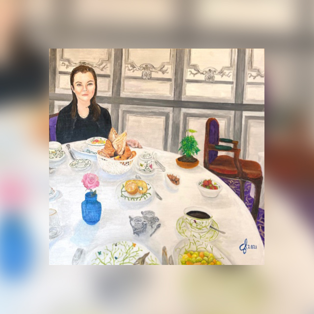
2/5 OilThis oil on panel painting measures 16 x 16″ and is entitled “Petit Déjeuner en Bordeaux.” It features a scene from one of Ellie and my favorite hotels and breakfasts at La Grande Maison Bordeaux de Bernard Magrez, which was unfortunately felled by Covid last year. The petit hotel is in an old mansion with impeccable service, absolutely gorgeous artwork (and I’m very picky with art), and a delicious breakfast with fresh pastries, etc. This painting was difficult to execute because the elements were so tiny. This is the smallest face I have painted and it was a challenge. Thank God for tiny sable brushes! You can see in the reference photo I took considerable liberty in making adjustments for artistic purposes. I’m also glad that I was able to paint a portrait, birds, and flowers. There will be a companion piece that you will see shortly. Learn MorePetit Déjeuner en Bordeaux


-
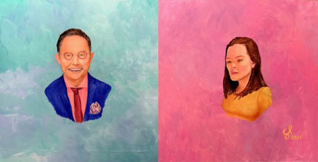
3/5 Oil“Playful & Pensive” and consists of two 16″ x 16″ wood panels. The painting features me and my wife Elsinore Lam on separate panels with two different moods, me being playful and her being pensive. Also, we have two different poses, me head on and her tilted at an angle. Further, my lighting is evenly lit and hers is more chiaroscuro. Getting sable brushes made a huge difference with doing Ellie’s portrait, and using fast-dry oils was an absolute joy! Learn MorePlayful & Pensive


-
4/5 OilThis oil on panel (16 x 16″) is entitled “Twilight at Le-Mont-Saint-Michel” and now forms a diptych with my “Petit Déjeuner en Bordeaux”. The two paintings together contrast each other featuring a bright interior morning in the South of France and a glow of twilight exterior in the North of France. Further, we are in the foreground in the evening painting, and Ellie is in the background for the morning painting. The foreground on the morning image is highly complex and the background is similarly so in the evening image, as a further point of contrast. Also notice when I put them side by side that there is a V shape to the principal elements (unintended) with elements descending from top left to bottom right in the morning image and bottom left to top right in the evening image. I decided to enhance that V shape by painting in tiny purple birds in flight on the top right (flying in V formation) to draw the viewer up from the foreground road to the top of the Abbey’s spire. The top left of the painting and the bottom right of the painting balance each other with negative space with the top left showing sweeping sky strokes and the bottom right showing short choppy water strokes. I took some liberty of combining and enhancing…elements. The original image had the background Abbey overlapping partially our heads and it did not suit the frame of the painting well. I also changed all the colors and made it evening time. Further, I made it high tide since it was dry land when the photo was taken. I moved some buildings around along the base to make it more visually interesting and balanced. Also, of course, I added my entire family including Kumo (who is now passed), Alessandra holding an apple, and our nanny Ruth pushing Enzo in a stroller. It is interesting how a cluttered background looks bad in a photo but adds depth, complexity, and a little bit of fun to a painting. This pair will go over my morning bar in my new home. Learn MoreTwilight at Le-Mont-Saint-Michel


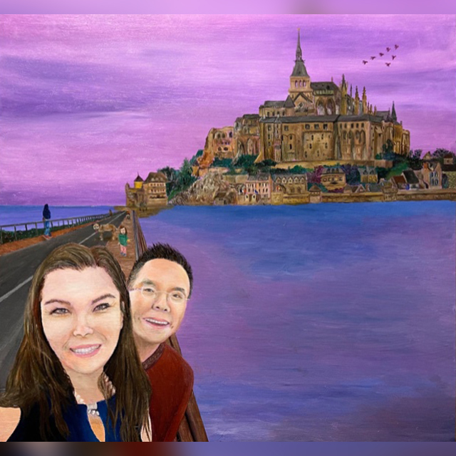
-
5/5 Oil“Floes Aglow”, Oil on linen panel, 48 x 36 inches. I was inspired on a trip to the Museum of Modern Art Fort Worth where I saw a painting by Leidy Churchman of the earth from space and it reminded me of ice floes. I started to research how ice floes looked on Pinterest and loved the complexity of the multiple layers of ice floes as revealed by gradual tonal changes. As I started to paint this painting, it unintentionally reminded me of Georgia O’Keefe’s massive cloud paintings, one of which I saw at the Art Institute of Chicago many years ago. The linen surface was single acrylic primed (unlike my last portrait that was quadruple oil primed and sized) in order to bring out some of the underlying texture of the surface. I was planning to use multiple blues but when I started using the Prussian blue by Williamsburg paints I was blown away at the gorgeousness of the color and the deep complexity of its many hues. (Very different from the Paris blue, which is technically the same blue, that I used for my recent tree painting.) I was able to create so many tonal shifts by thinning it with linseed oil and mixing it with various degrees of titanium white. The blue dried relatively quickly within… 24 hours without even using an alkyd medium, so it afforded me the ability to paint it wet (so oil was the perfect medium for this painting) and various degrees of drying in order to easily render the progressive layers of ice by painting the deeper layers with minimal white paint on wet blue paint and the top layers with a lot of white on a dry blue background. It’s the first time I have exclusively used two colors to cover 80% of a panel or canvas. Truly extraordinary colors. I also love the complementary cadmium orange in the sky that is shockingly intense. In this painting I have veered back to the semi-abstract but don’t think I will ever return to full abstraction, at least not for awhile. Representational and figurative work is so compelling to me right now. Learn MoreFloes Aglow


-
Walk in the Woods with Wolf
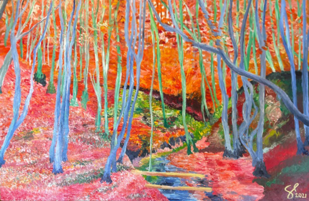 1/17 AcrylicsThis acrylic painting on 24 x 36” board is entitled “Walk in the Woods with Wolf”. The title comes from one of my favorite artists Wolf Kahn, whose bright landscape style is actually much more reductionistic than what I’ve done here, as I have leaned toward complexity. If you blow up the painting, you will see that I used a different impressionistic style for each part of the background, including pointillism, radial brush strokes, horizontal brush strokes, and circular strokes. The color also changes throughout. I contrast the horizontal background with the vertical foreground and I used a warmer background tone to the cooler foreground to create a visual tension between those two elements. This painting was on the verge of ruin multiple times and was brought back from disaster as I explored various techniques during the process of creating it. Learn More
 -
Ma Cherie Blossom


 2/17 AcrylicHAPPY NEW YEAR!!! This acrylic on 24” round board is entitled “Ma Cherie Blossom”. The title comes from the French expression for “my dear”, as I speak to her in French every day and “cherry blossom”, which is the English name for the flowers that frame the image and in Japanese is Sakura, Alessandra’s middle name. Again, I’m exploring my two favorite themes: portrait and flowers. I really challenged myself with the hair and the bear. I painted the flowers in a semi-abstract style to contrast with the realism of the central area, and again I love metallic colors, so the painting is framed in gold. The green is about 60% permanent light green and 40% light phthalo turquoise. Love that combination. The dress took 6 different reds and oranges to compose to create the final depth. This will be my last circular portrait for awhile. Hope you enjoy! Learn More
 -
Stargazer


 3/17 AcrylicMerry Christmas everyone! Just finished this acrylic painting on 30” round board entitled “Stargazer”. The title comes from the name of the flower Elsinore Ellie Lam is holding (also featured in the background) and also the fact that Ellie majored in astrophysics not to mention the positive connotations of a bright future. The original idea was inspired by Kris Knight’s portraits. As you know, I love flowers, which is a prominent theme in this painting from the flowers on the dress, to the flower Ellie is holding, to the background wallpaper pattern. The background is also reflective of the textiles that I love in Raoul Dufy’s work from an exhibit I saw in Japan last year and that inspired a series of paintings I did in 2019. The gold halo is a reference to Renaissance Christian iconography, a theme that I explored in a prior color-pencil drawing entitled Halo. It took me a while to settle on an appropriate …background. The background looked too plain without any flowers but I was too worried of it being too busy with flowers, so I settled on a stripe of flowers that almost conveys a sense of motion and keeps the tension between busy and simple intact. I also used a tone-on-tone color scheme to make the background not stand too far forward of the foreground: bronze on gold and medium violet on blended light violet/white/light phthalo blue. Hope you enjoy! Learn More
 -
Kaleidoscopic Cornucopia
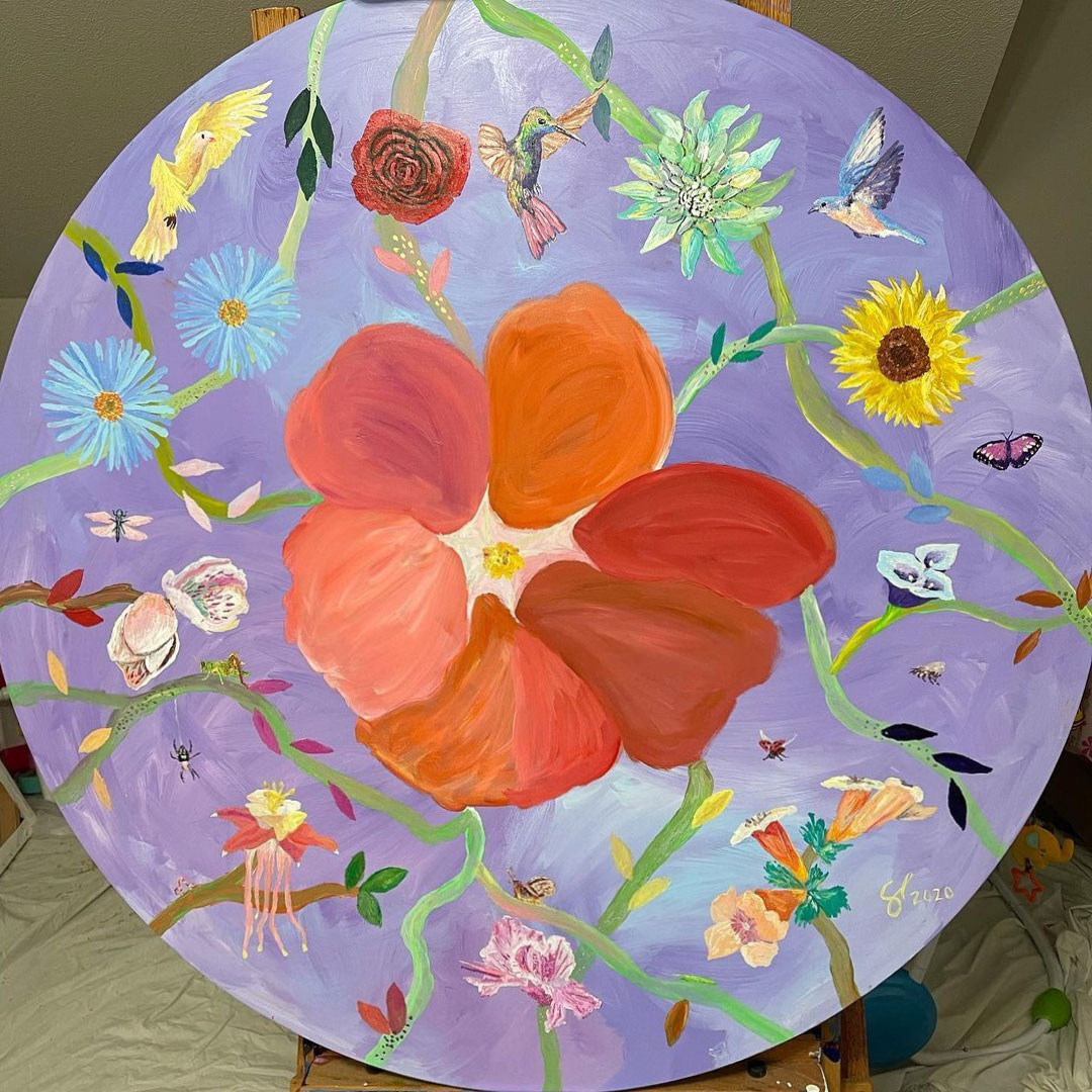 4/17 AcrylicThis painting appropriately finished today on Thanksgiving is entitled “Kaleidoscopic Cornucopia”. It is an acrylic on 36”-diameter round board. Initially, I waited two months for these little round wood pieces from Europe to be glued on the board, but they never arrived. Thank God because I love this project far more. As you know, I have drifted away from abstraction to more representational work. I’m exploring my favorite themes: flowers, birds, and nature. The flowers and birds are not 100% reflective of reality. I took some liberty with the color and style to make them more artistically interesting. I call this style impressionistic realism. The flowers on the top half are en face and on the bottom half reach up to the sun. The birds occupy the upper half of the frame, and the lower half progresses from small flying things to creepy crawlers. I also incorporated abstracted elements like the background and the leaves, the latter of which are reminiscent of Matisse’s paper cutouts, a theme that I have explored before. This will go in my office. Hope you like it, and Happy Thanksgiving! Learn More
 -
Roses Aren’t Red
 5/17 AcrylicFinished my 9 x 9 foot acrylic mural entitled “Roses Aren’t Red”. Thanks to Richard Crawford for building the massive scaffolding spanning two floors, and thank you Juan Garza for getting me supplies, a fan, ice water, and helping me cleaning up. This painting is inspired by Cy Twombly’s Roses series. Ellie wanted something totally abstract but my love now for figurative work prevented me from a fully abstracted piece. As you know, I love flowers, and on the bottom of the stairwell will be my other painting on flowers, the stained painting I did last year. Coming up the stairs you won’t see this painting, so the stairwell looks clean but when you round the corner it’s there. Also it will be the only painting you can see from the second floor. Learn More
 -
Grand Canyon
 6/17 AcrylicFinished this 3.5 x 15 foot acrylic triptych painting entitled “Grand Canyon” that will extend across one wall of my bedroom. It was inspired by David Hockney’s Grand Canyon, and this like his is an invented landscape. I tried to make each panel appear unique and different but thematically and by color be unified as a whole piece. I used a limited color palette of like 10 colors for the entire painting to keep it unified but clearly the style and the colors are highly abstracted and meant for visual interest rather than for representational value. Learn More
 -
Big Rock Candy Mountain
 7/17 AcrylicThis work entitled “Big Rock Candy Mountain” is on two canvases of 5 x 5 feet making it 5 x 10 feet in total. This painting has morphed so many times and has finally landed as a bright and massive painting for Alessandra’s future nursery. The title is from the folksy joke song that Ellie loves to sing and reminds her of where she was born in northern Georgia/Tennessee. Of course, also these bright and stylized mountains look like big candies and hopefully will make her room tasty and joyous! I used almost half of my 16 oz. jar of titanium white to make the colors more pastel and muted, especially in the background where it is more distant and misty. Hope you enjoy this playful painting! It will be my last one during this Covid time before returning to work. Learn More
 -
The Long Journey
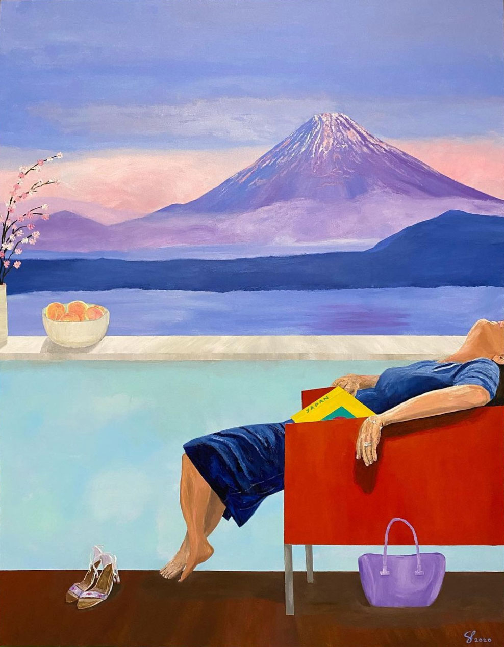 8/17 AcrylicThis work is entitled “The Long Journey” and is an acrylic painting on a 4 x 3 foot canvas. Ellie is shown after a long day of travel returning back to the hotel with a view of Mount Fuji. This is an imagined scene since I don’t recall ever staying in a hotel facing Mt. Fuji. It continues my themes of travel, Japan, and a split frame divided 50/50 like the last one of Ellie in a pool in Santorini facing the ocean. I love the colors of Mt. Fuji. I could look at that part of the painting for hours! The partially truncated head has multiple intentions. First, it shocks the viewer and frames the painting in a very unique way. Second, I was really inspired by an interview with the artist Cecily Brown who said that the face defines the narrative of the painting and overly dominates the painting (which is absolutely true), so by partially obscuring it the painting removes that element. Third, it’s a figurative statement that the mind is wiped out after a long day of travel. The open guide book set on the lap further symbolizes mental fatigue. The items in the room symbolize femininity like the purse, peaches, and shoes not to mention the swooning appearance. This is contrasted against …the masculine presence of the mountain, which also has a feminine loveliness to it as well. There is a lightness to the upper half of the frame and heaviness to the lower half that provides another interesting contrast. The peaches also symbolize Japanese-ness, longevity, and truth. This painting will go in the hallway upstairs. My next painting will be massive and insane! Stay tuned. Learn More
 -
Solitude in Santorini
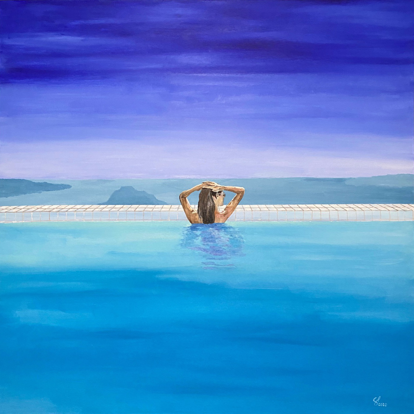 9/17 AcrylicThis painting is entitled “Solitude in Santorini” and is an acrylic painting on 4 x 4 foot canvas. The idea came from Ellie wanting more abstract pieces for the home and my inability to escape figurative paintings. I thought that making 90% of the canvas filled with simple blues would appeal to her and fortunately she agreed to it. This painting is a sequel to my pastel “Sunrise in Santorini” and both feature Ellie in the pool at our hotel Astra Suites located in Imerovigli in Santorini looking right over the center of the crater facing the volcanic cliffs, the three peaks which you can see in the misty background. I used ultramarine blue, light ultramarine blue, and white for the sky, deep cerulean blue and white for the sea and the volcanoes, light phthalo green, light phthalo blue, white, and brilliant blue for the pool. The wall is a mixture of primary cyan, anthroquinine blue, and white. The shadow in the pool is composed of light phthalo blue and green, brilliant blue, white, and dioxazine purple. I transitioned from dark to light then light to dark from top to bottom and from blue to green and green to blue in the colors. Learn More
 -
Birds of Paradise
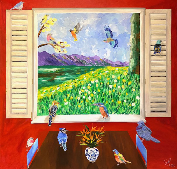 10/17 AcrylicThis painting is entitled “Birds of Paradise” and is an acrylic painting on 6 x 6 foot canvas. This is the largest canvas that I’ve done these past few months, and it is so large that I couldn’t bring it upstairs to my art room and mount it on my easel, so I had to paint parts of it lying on my side on the floor. The painting combines an impressionist-style landscape with a realistic foreground consisting of birds, window, table, and vase. The title of the painting refers to the name of the flowers and the birds, of course. The vase also has a bird and flowers on it. The surreal painting will be the centerpiece of my dining room. Learn More
 -
The Dance
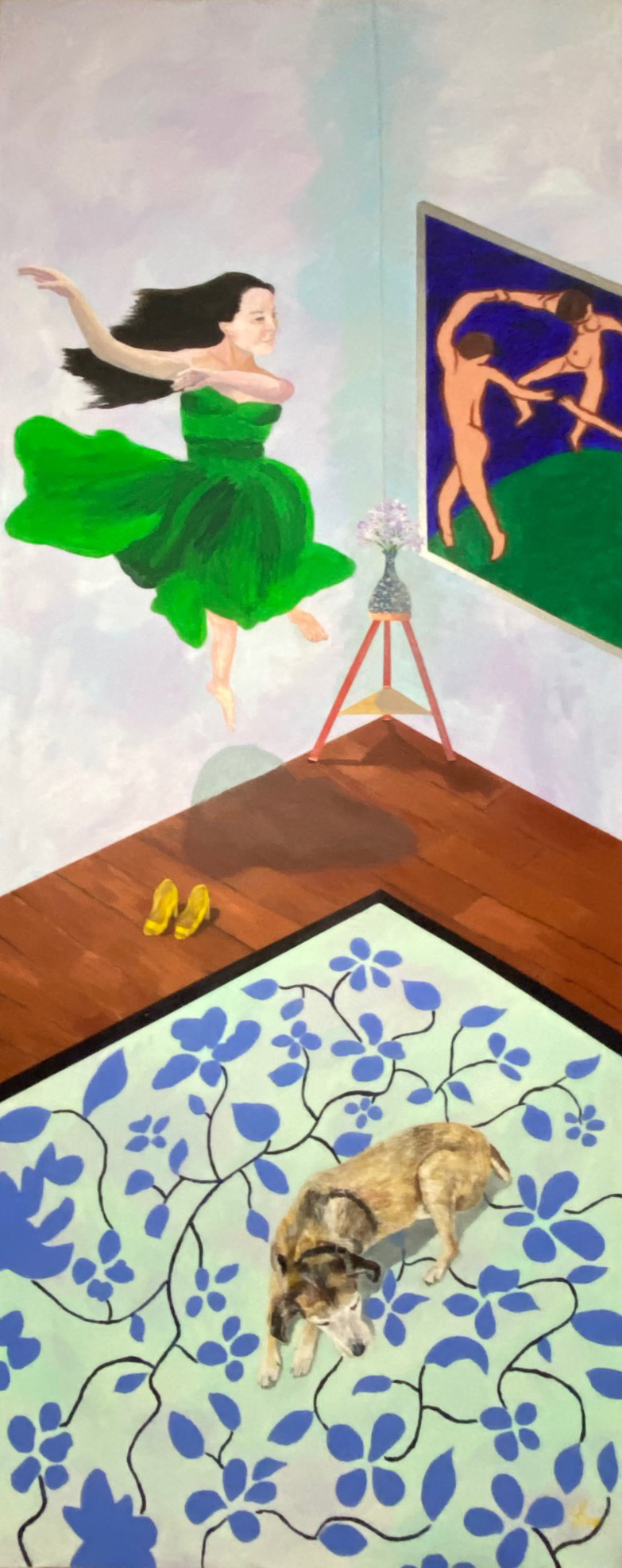 11/17 AcrylicThis painting is entitled “The Dance”. It is an acrylic on an 8 x 3 foot canvas. It is the tallest painting that I’ve ever done and it has taken me the longest time, a little over a week, that I have worked on a single painting. It is so tall that I had to use a ladder to paint the upper half of the painting. The title and concept are based on Matisse’s “The Dance”, which is featured on the right side. The vase of flowers and the angle of the painting are taken from one version that Matisse did with a vase of flowers with his painting of the Dance as an element within his painting, so my painting is a painting of painting within a painting. This painting will be at the end of a long hallway leading to my bedroom. I chose the jumping dancer as the focal point to fill this vertical frame. If you see, the perspective of the painting is also from an elevated vantage looking down as if you the viewer are also dancing in mid-air. I painted my wife’s face onto the pose of a dancer (attached). I wanted the stillness and solemnity of my dog Kumo to anchor the bottom half of the painting. Learn More
 -
Shine On
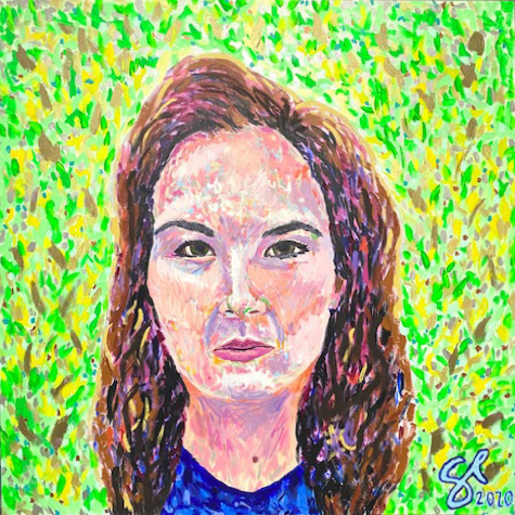 12/17 AcrylicThis painting is entitled “Shine On” and it is an acrylic on 5 x 5 feet canvas, my largest portrait I’ve ever done. The title has three meanings: the expression means to carry on and it refers to our ability during the Covid crisis to Shine On; it refers to one of Ellie’s (and my) favorite artists, Pink Floyd; and it refers to the sheer brilliance of colors including the use of bronze, copper, silver, and gold, along with violet and orange interference paints (the latter of which you can’t even see in this photo). This painting will be over my fireplace and you first approach it from 90 degrees down a long hallway. There is direct sunlight on it, and all you will see at first are these brilliant sparkles from an angle! Learn More
 -
Double Portrait
 13/17 AcrylicThis painting is entitled “Double Portrait” and features my mom and dad. It is an acrylic painting on 6 x 4 feet canvas. It is my most ambitious painting to date and represents my first attempt at an acrylic portrait, very difficult considering the incredibly fast dry time but I liked the challenge. The painting is inspired by David Hockney’s 1971 painting of Sir David Webster which was of a similar size, color palette, and medium (see attached). In fact, I copied his table as an homage to the artist and his work. As you can see on the table there are three books. All books may or may not exist in reality but they do in my imagination. The first book is on Hockney’s double portraits, of which he is famous and which is why I entitled this painting double portrait. The cover features his famous Portrait of an Artist that sold for $90 million making him the most expensive living artist until he was eclipsed by Jeff Koons at $91 million. The painting on the cover of the book features a swimming pool and with my Santorini painting that …had a swimming pool in it I was inspired to explore Hockney more in depth, which inspired this painting. The second book on the table entitled Museums of Naoshima references museums that I really want to see on a small island in southern Japan near my mother-in-law Masako’s home island of Shikoku and the book is an allusion to her. The bottom book on the Chèvre D’Or hotel in Eze is a stand in for my wife Ellie and also a reference to my previous painting on the same subject. The cross in the center of the painting represents the centrality of Christ in my life. The Sakura (cherry blossom) flowers represent my daughter (her middle name), and the same flower is in my dad’s handkerchief. The flowers are situated in a Ming vase, which represents my Chinese heritage. It also features two birds that my wife wanted me to paint, which represents us. The style of the painting is a mixture of realism and expressionism, the latter of which is especially expressed in the skin tones and facial features. Hope you enjoy! Learn More
 -
Spring Returns
 14/17 AcrylicThis is the largest painting I’ve done 4’ x 16’ entitled “Spring Returns”, and it is an acrylic painting on clear acrylic panels. The title alludes to the Spring time we are currently in, our Spring that will return when this Covid crisis is over, and of course the flowers in the painting. It will be mounted floating in front of a limestone facade at the main entry of our wellness building when you walk in. As everyone knows, I love flowers and they cheer me up! Hope it cheers you up! I can’t show the painting as one piece because the painting is too long horizontally. Learn More
 -
Giverny
 15/17 AcrylicJust finished this 5’x9’ oil & acrylic on canvas entitled “Giverny”, my first oil painting and largest canvas I’ve done. It is obviously inspired by my visit to Monet’s lovely garden a few months ago in August followed a week later by my visit to the Kimball to see Monet’s later years, a truly awe-inspiring exhibit. This is the farthest I’ve delved into representational art but I can’t escape some of my roots in abstraction, which is mainly exemplified here through the color scheme. The background, Japanese bridge, and water flowers were done in acrylic followed by the water lillies and trees in oil. I have included some details of the painting since it is near impossible to appreciate it on a mobile device. Learn More
 -
Les Fauves
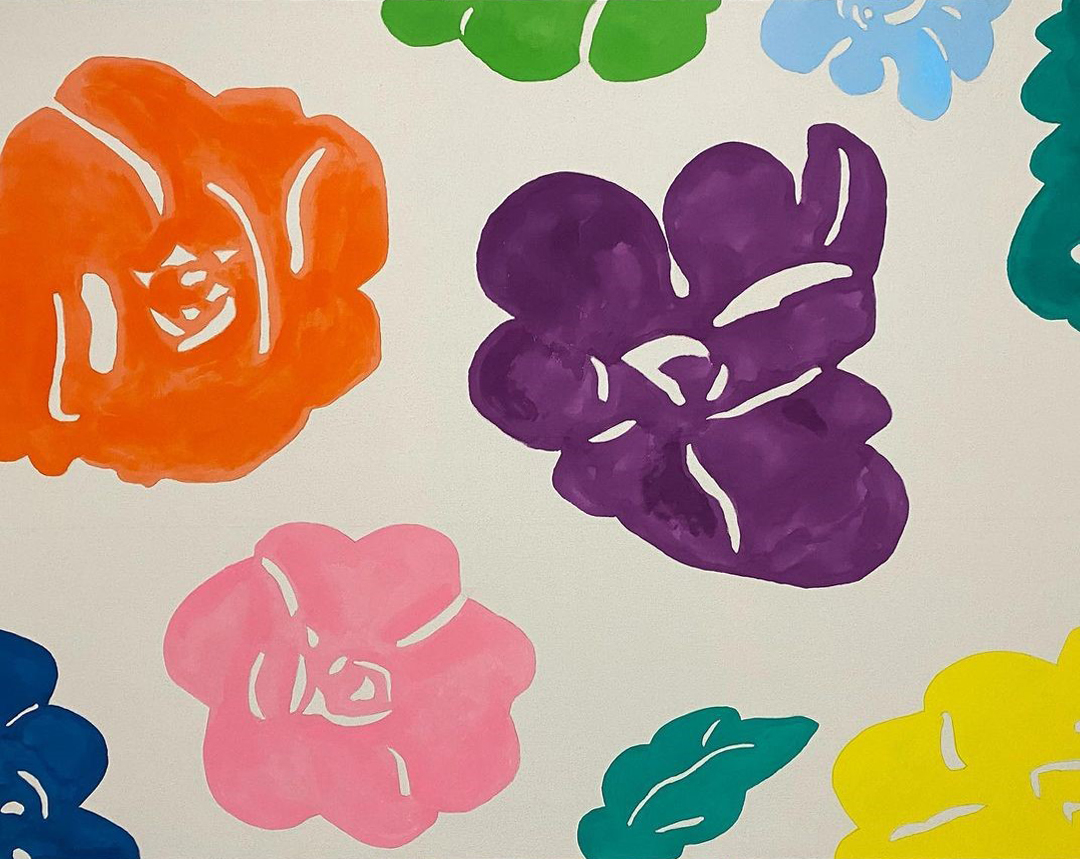 16/17 AcrylicThis painting entitled “Les Fauves” (6’ x 4’ Acrylic on Unprimed Canvas) was inspired by an exhibit that I saw in Tokyo of Raoul Dufy’s work on his textile designs. As you probably know, Dufy was known for his participation in the Fauvism movement (one of my favorites), which was known for its bright colors and abstracted style. Also I’ve been inspired by one of my favorite artists Morris Louis who was renowned for his “stained” paintings in the 1950s. This follows that style. I used airbrush and solid acrylics thinned and extended with GAC airbrush extender that allows it to soak into the unprimed canvas. I used different gradations of the paint to simulate a watercolor or stained look. I took a lot of closeup photos in different angles so that you can appreciate the watercolor effect-like tonality that adds depth and intrigue to the painting. This technique is difficult because any mistake cannot be corrected: one drip, one drop, or one stroke out of place is unfixable. This will ultimately be protected with a clear acrylic box and all paintings will be featured in my new office expansion. I’ll be starting on my largest canvas ever and will be my first attempt at oil painting. Good bye acrylics for now! Learn More
 -
Four Earths
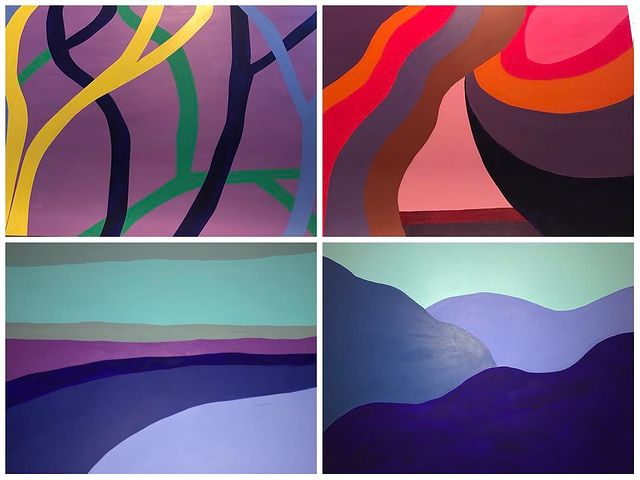 17/17 AcrylicMy “Four Earths” tetraptych will start as you walk down the hall on the right side of the wall with the bottom right (mountain) then progress to bottom left (shoreline) then you turn the corner and see top right (desert) and finally top left (jungle). This will join the old and the new wings of my wellness building. Learn More
-
1/5 PastelThis painting is entitled “Sunrise over Santorini” and is a soft pastel on 22 x 30” hotpress watercolor paper. This painting incorporates Impressionist, Post-Impressionist, and contemporary styles (inadvertently Hockney) using extremely bright, saturated colors that do not necessarily reflect reality but captures the imagination. I used no fine pastel pencils, only rough and saturated soft pastels. This painting continues my fantasy travel series during this Covid crisis. Santorini is one of my favorite places in the world, and this painting was based on our time at Astra Suites in Thira, in the center of the Santorini crater. As you can see from the reference photos, I moved the painting from sunset to sunrise to express the brighter colors. I also combined two photos into one so that I could capture the central peak and the two flanking curves of the crater in one image. Further, I moved the sun over compositionally to the left for better aesthetic balance. When we were there, in the morning we would have breakfast made to order on our balcony looking over the morning fog that settled over the craggy peaks. What a memory. I hope you enjoy these travels together! Learn MoreSunrise over Santorini
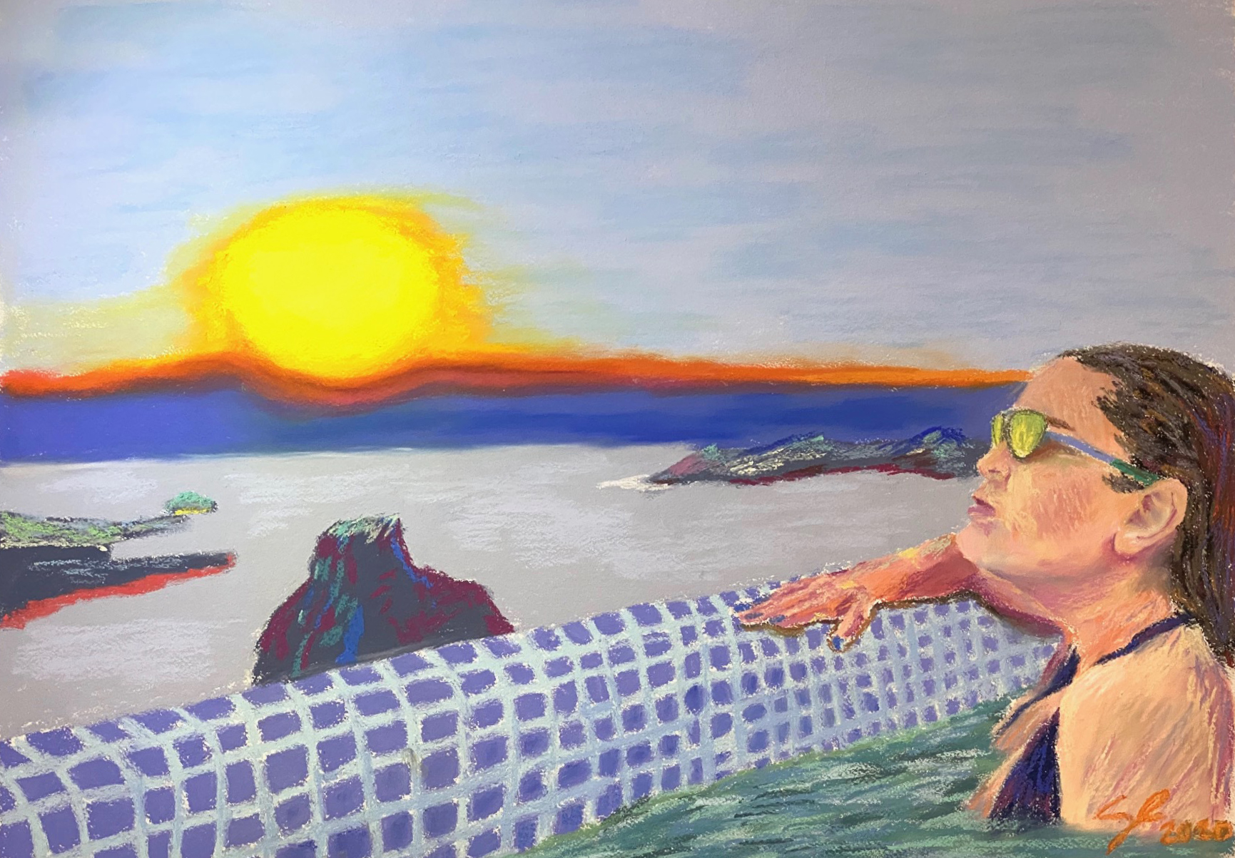
-
2/7 PastelThis painting is entitled “Dreams of Eze”. It is a soft pastel on 24 x 16” hot-press watercolor paper and it is dedicated to my dad (see below). It represents a radical departure for me from my previous work that attempted to achieve more realistic renderings. It is inspired by the Impressionist, Post-Impressionist, and Fauvist movements. You can see boldly imagined impasto strokes, rough smears, exposed paper, and unrealistic colors. Sorry the colors in these photos look nothing like the original. It is also a memento to my father who painted Impressionist landscapes and figures with pastels. I hope he likes this painting from heaven. (I know he does! Miss you dad.). As we stay locked shelter in place, I dream of the time Ellie and I traveled to her favorite French Riviera town, Eze, where I brashly claimed I had been and we didn’t need to go because I studied French when I was in college in Provence. Well, I actually totally missed that city and went to the neighboring village Eze-Sur-Mer, which is …nothing like it. Eze is an elevated medieval city filled with trellised gardens, cobblestoned streets, and magnificent views of the ocean. As you can see, I have reimagined parts of this painting with French Riviera flora as compared with the dry landscape of the original reference photo. I love color and love Matisse. Ellie’s dress is an homage to some of Matisse’s dress patterns. Also, the hotel where the movie Bucket List was filmed was where we stayed: Chèvre D’Or. Our bathroom was carved into the side of the mountain. I hope you enjoy your travel to southern France with me! Learn MoreDreams of Eze
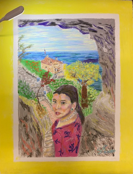
-
3/7 PastelThis painting is entitled “Together Through This” (Pastel on 22 x 19” Toned Gray Paper). This pandemic tragedy has brought my wife and me closer together knowing that we rely on each other to get through these tough times, fully recognizing how blessed we are already and continue to be. We are also together with our Lord who is always with us, as represented in this painting. My faith is helping me cope with where we are. If you don’t have a faith, I would love to share with you what has given me hope and joy (PM me). Much love to all of you and wishing you peace and comfort through this time. I am also together with all of you: my friends, family, staff, colleagues, acquaintances, and patients. Learn MoreTogether Through This
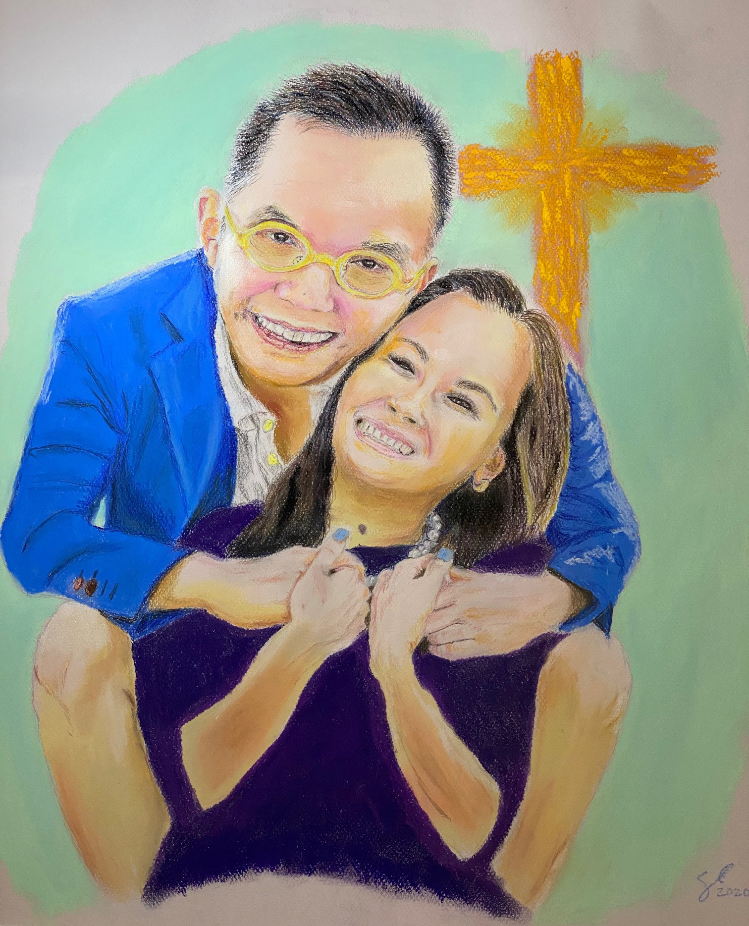
-
4/7 PastelWishing okaasan Masako Minami an early birthday since I will be without a secure connection soon during my travels. Ellie and I love you very much. Here is a preview of your surprise birthday gift. It is a pastel on paper and it is based on the photo of you and Alessandra last August after we visited the Monet exhibit at the Kimbell Art Museum. Hope you have a wonderful and joyous day! Learn More(Untitled)
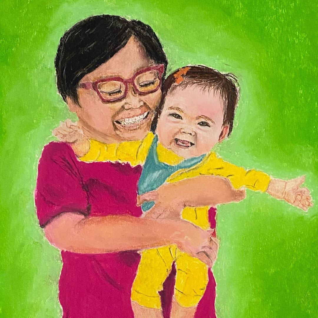
-
5/7 PastelThis pastel on sanded paper is entitled “Joy” and features my baby Alessandra. Unfortunately, the tonal transitions look horrible in these photos. I can’t quite capture the image with my iPhone. Learn MoreJoy
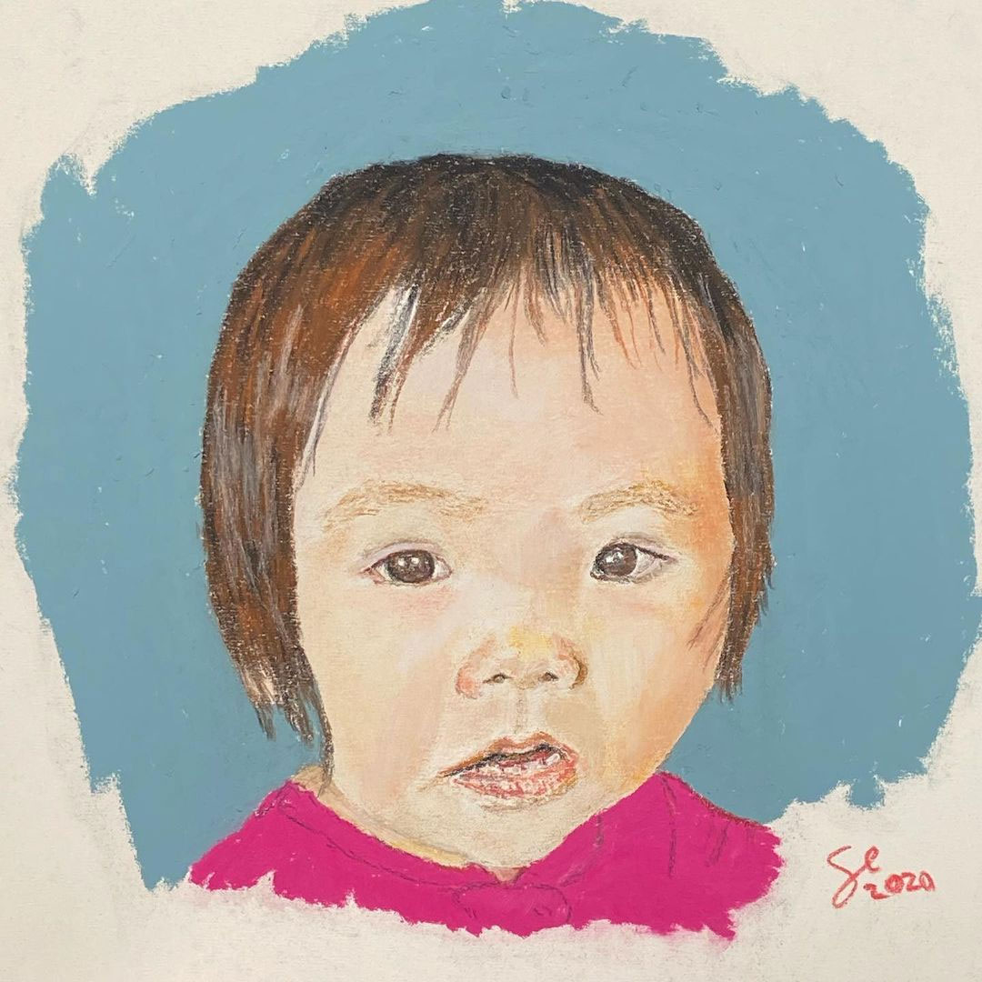
-
6/7 PastelThis finished tetraptych is entitled “Family Portrait” and is pastel on 12 x 16” sanded color paper. Learn MoreFamily Portrait
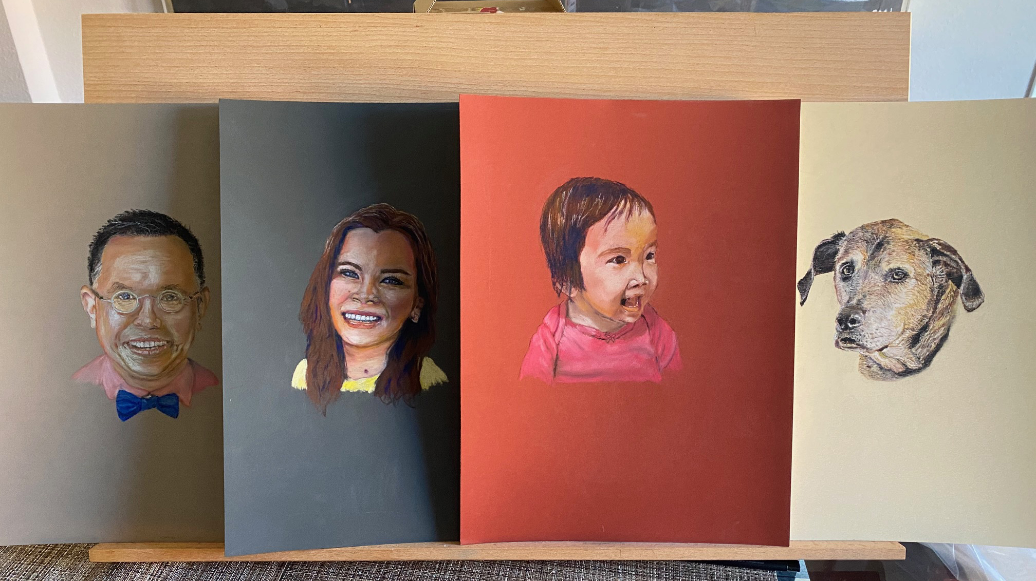
-
7/7 PastelJust finished my first pastel piece. Simply put I love pastel. It could be my favorite medium so far. So detailed yet so highly expressive. Plus I can use my finger as a blending tool, which is not allowed for color pencils or graphite. My father did amazing work with pastels. The choice of dark background was inspired by my visit to the Renoir exhibit last weekend where his chalky pastels on paper were truly gorgeous. Again, this photo looks nothing like the original because the smooth gradients are completely lost with my iPhone. I tried everything to capture it but to no avail. The transitions here look rough but they do not in person. Wish you could see the original. Totally different. This piece is done on sanded paper, which made the experience effortless and wonderful. I don’t think I will be using cotton paper ever again unless I’m doing a watercolor obviously. There is no title for this piece or signature yet because most likely it will be part of a triptych or tetraptych. Learn More(Untitled)
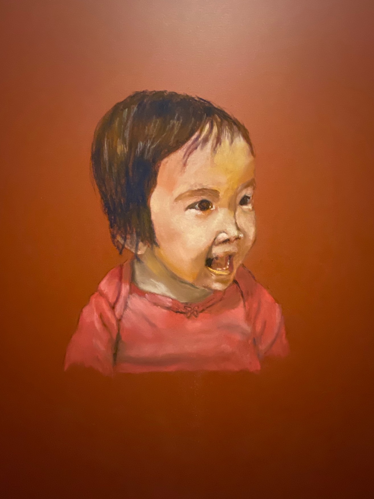
-
1/10 Water ColorThis is my second attempt at graphite pencil and it turned out a lot better. I really wish you could see this in person because the subtle tone is completely lost in this horrible photo taken at night with bad lighting. It also looks distorted. Terrible! It is entitled “Wonder” and features my daughter. It is graphite and watercolor on 30 x 22” hot-press watercolor paper. Learn MoreWonder
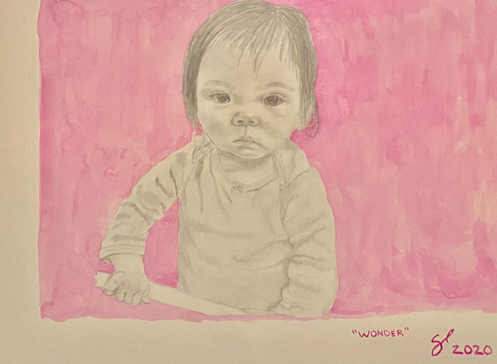
-
2/10 Water ColorThis is my first attempt at graphite pencil, and it was fun and challenging! This piece is entitled “Radiant” and is graphite pencil and watercolor on 30 x 22” hot-press watercolor paper. It was taken just before our wedding on the beach in 2016. Learn MoreRadiant
-
3/10 Water ColorThis painting entitled “Ma Petite Ange” is my first attempt at doing an ink and wash painting, which was done on 10 x 14” cold-press fine-grain watercolor paper. As you can see with the attached photos, I replaced Alessandra’s head with a still from a video since the original photo was taken about 6 months ago and I wanted to update her head. This is the first time I’ve been able to use my 108 set of Holbein watercolor paints from Japan, and they are magnificent! Learn MoreMa Petite Ange
-
4/10 Water ColorThis 22 x 30” watercolor is entitled “Hug” and features my wife Ellie and my dog Kumo. The challenge was getting the dog fur looking good. Took me awhile to make that look pleasing to my eye. I like the vertical orientation and the use of negative space here. The colors really look much more striking in person. The orange background looks as bright as in the close-up image not the muddied appearance from the distant photo. I also included the pencil drawing and an earlier version before the application of gouache. Learn MoreHug
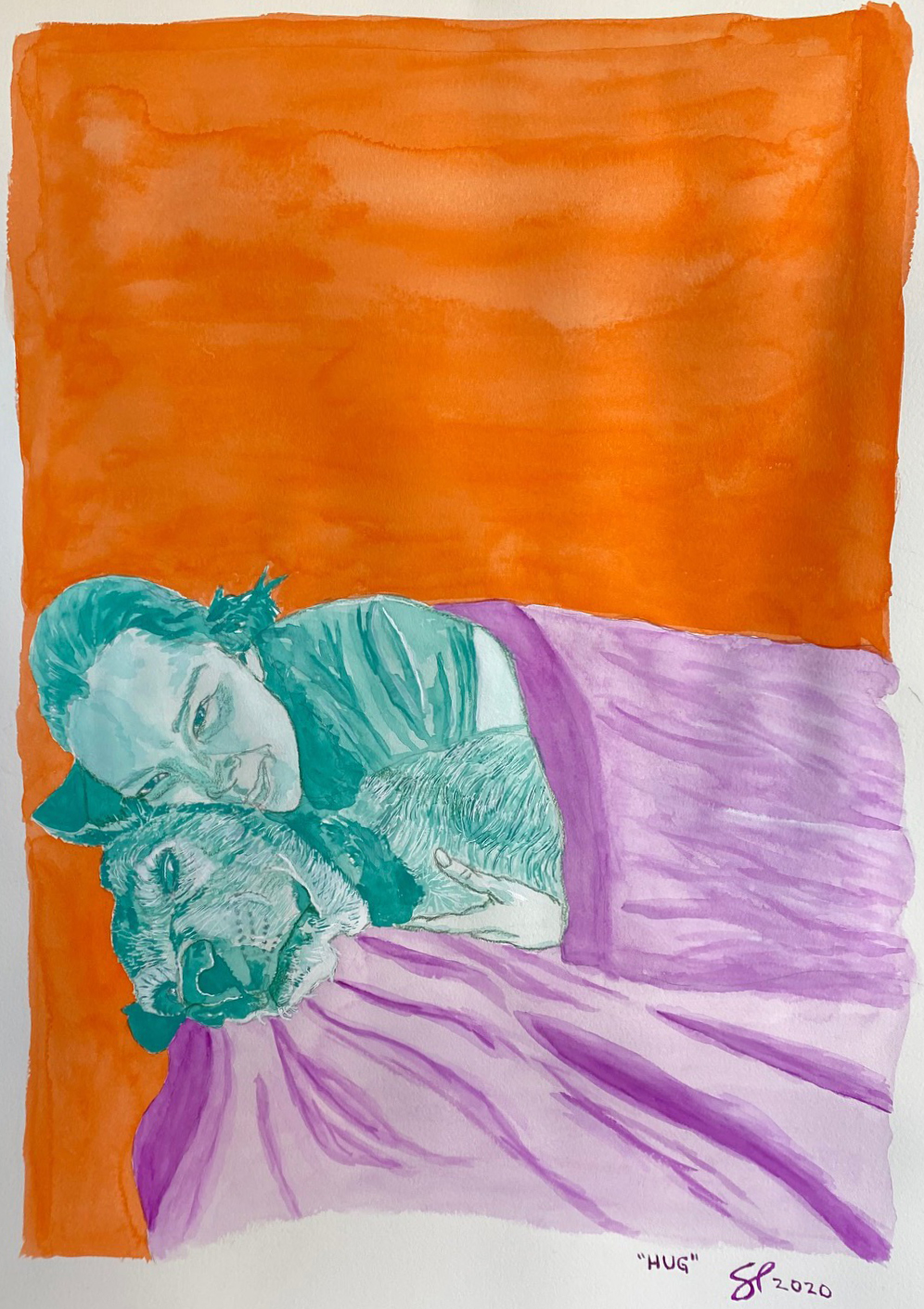
-
5/10 Water ColorThis 30 x 22” watercolor is entitled “My Love” and was rescued from the brink of disaster. There is a gouge and a tear on the paper near my right ear, Ellie’s eyes were messed up, and the watercolor bled uncontrollably. I was depressed and was going to chuck the whole thing. I knew that if I could save Ellie’s eyes and make them look good this watercolor had a fighting chance. I used a white gel ink pen to reshape the eye and a dark blue color pen until I saw her identity return. I then fixed the skin tones, fixed the hair and the dress, and then used a darker shade of blue to cover the deepest part of the tear that corresponded to the top of my ear and did a darker shade of sky over the tear then lightened the tear with gouache. Not perfect but good enough. This was taken right before our wedding in Cabo on the beach. Great memory! Learn MoreMy Love
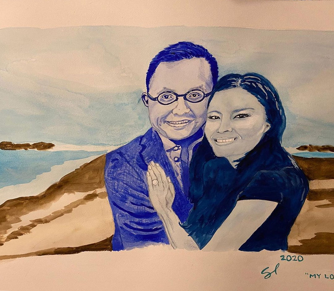
-
6/10 Water ColorBelated Birthday gift to my mom! This 30” x 22” watercolor, gouache, and color pencil painting on cold-press watercolor paper is entitled “Family” and features my mom, dad, and baby Alessandra. The hardest part of this portrait was getting the heads the right size relative to each other, especially since these portraits came from three different photos. Even a couple millimeters in difference in eye size led to my dad’s head being 4 times too big then my next attempt the face was 1/3 the size of my mom’s. I fixed it by drawing the circle of the head and then drawing within it. Learn MoreFamily
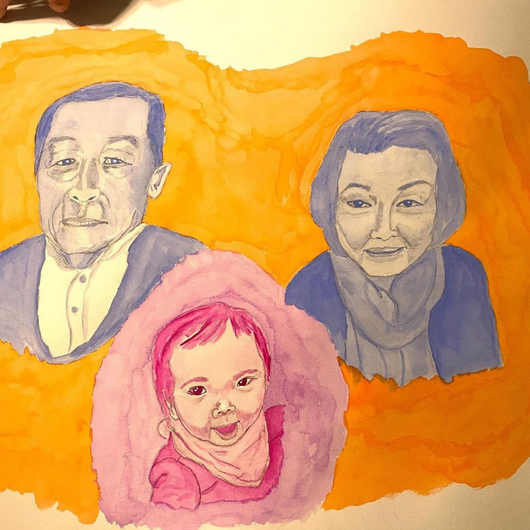
-
7/10 Water ColorHappy New Year from the New Year baby, Alessandra! I did this painting today on my day off. It is entitled “Happy” and it is a watercolor, gouache, and color pencil on 30”x 22” cold-press watercolor paper. Learn MoreHappy
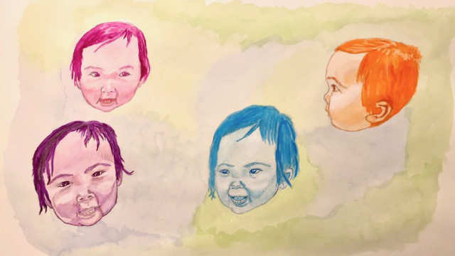
-
8/10 Water ColorThis painting is entitled “Love” and features my wife Ellie and daughter Alessandra that I did this past weekend and finished this morning before work. It is my third attempt at watercolor and freehand illustration, and I’m getting better at it now. It is a watercolor, gouache, and color pencil on a 30” x 22” cold-press watercolor paper. The hardest thing to do was to do the baby’s face since in the original photo I didn’t like the facial expression so I had to find another one that conveyed the emotion but that photo was taken from a different vantage point, so I had to take the head shape from yet a third photograph and make a composite of all 3 photos. Again, the colors look a lot better in person! I have attached the original photos, but you will see that I took some subtle artistic license to make shadows and shape slightly to my taste. Learn MoreLove
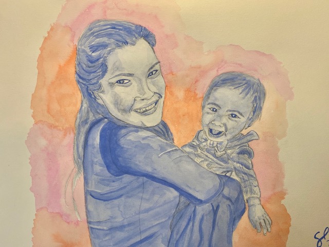
-
9/10 Water ColorMerry Christmas! This painting I did this morning is entitled “Sakura-Chan” and named after my daughter Alessandra Sakura Lam. It is my second attempt at watercolor and my first at portraiture. It is a watercolor and color pencil on 30” x 22” hot-press watercolor paper. This looks sooo much better in person. I simply cannot capture the complexity and richness of the color palette and tried all different lighting conditions to do so. I hope that you will be able to see it in person. Haven’t decided where I’m going to hang it yet. Learn MoreSakura-Chan
-
10/10 Water ColorFinished my first watercolor triptych entitled “Wonders of the World” (32”x 36” each panel, 9 feet together including future framing) celebrating all of God’s wonderful flora and fauna. I first attempted an airbrush work but my cheap airbrush looked terrible, so I decided to experiment with watercolor and I love it! The rich tonality is unmatched by any medium I’ve ever used, and I started trying it because of my flower stain painting using extended airbrush paint on unprimed canvas that inspired me to explore watercolor. Since this was the first time I’ve done illustrations and watercolor, each panel got better from green to magenta to lavender/blue. This is my deepest dive into representational work but I can’t escape my passion for abstraction through the pattern and choice of color. My third panel has my dog, Kumo the magic dog, as the centerpoint for those who know Kumo! Learn MoreWonders of the World
-
Kind of Blue


 1/7 COLOR PENCIL“Kind of Blue”, color pencil on toned paper, 11.5-inch diameter tondo. I was able to complete this portrait in time for Mother’s Day. I have been wanting to explore grisaille portrait for quite a while and was inspired by an artist who did a similar portrait with color pencil. He used a Kohinoor color pencil, which is what I used and the color pencil is unique in its buttery application. I love this violet gray color, which I have used in the past for similar grisaille pieces in watercolor. I will be framing this portrait as a tondo with a customized 2-inch wood frame in a similar blue color. The title of the piece comes from my favorite Miles Davis album and as a double entendre with the color of the ink as well as the melancholic solemnity of the expression. I like to explore different human expressions in my paintings. Hope you enjoy, and Happy Mother’s Day!
 -
Another Miracle


 2/7 COLOR PENCILThis colored pencil on 9 x 12″ toned gray paper is entitled “Another Miracle”. The title refers not only to Enzo, my new son but also to Ellie surviving two ER visits in one night that were totally unrelated: one for pulmonary edema and shortness of breath and the other for uterine bleeding that led to an overnight ER stay and culminated in a 4-hour surgery that ended with a uterine artery embolization that saved her life. I’m grateful for these two miracles. This painting is unsigned, as I may combine it with my “Hello World” colored pencil piece. Learn More
 -
Hello World


 3/7 COLOR PENCIL“Hello World,” colored pencil on 9 x 12″ toned gray paper featuring baby Enzo! Haven’t done any color pencil work for almost a year now but it was fun. The crazy patchwork of skin color of a newborn made this exercise a lot of fun. No serious artwork here but just passing time in the hospital with Ellie and little one. Learn More
 -
Faith Hope Love


 4/7 COLOR PENCILThis drawing is entitled “Faith Hope Love” and features my parents. It is a charcoal and color pencil on 9 x 12” toned-gray paper. This is my second attempt at charcoal work, and I love it! Learn More
 -
Bolero


 5/7 COLOR PENCILThis drawing is entitled “Bolero” and is a charcoal and color pencil on 9 x 12” tone-gray paper. The title comes from a Spanish dance, and the rose in Ellie’s hair somehow reminds me of a Spanish dancer. This is a first attempt for me with charcoal, and I found it to be a wonderfully expressive medium. Using white charcoal and tone-gray paper was a lot of fun! As you know, I simply have a hard time escaping my desire for some color, so I was planning all along to add the splash of color to the rose. Initially, I was thinking about using pastel, my favorite medium, but the chroma on the red would have overpowered the drawing. I was then going to use …charcoal willow sticks for the background but I decided it would have swallowed the facial features, so I went with shades of baby blue with darker tones near the lighter highlighted hair. The blue also complements the red rose and balances the drawing. Also, as you can see I can’t escape my passion for portraits and flowers. This drawing allowed me to combine my two passions into one subject. Hope you like it! Learn More
 -
Halo


 6/7 COLOR PENCILThis is entitled “Halo” and is a color-pencil painting on 16 x 20” sanded white paper. It features my wife Ellie and child Alessandra. I replaced Alessandra’s face with a more recent photograph (attached) because she has a better expression. Learn More
 -
Best Buddy


 7/7 COLOR PENCILFinished my first color pencil work. This medium requires a lot of patience and a ton of time, especially because I didn’t use sanded paper, which would have cut my labor by a large degree. Again, this photo is terrible and makes the drawing look choppy when the gradients are much smoother in person. This color pencil on paper measures 30 x 22” and is entitled “Best Buddy” and features me and my dog Kumo. Hope you enjoy it! Learn More
-
The Purple Tree
“The Purple Tree”, Oil on Canvas, 72 x 48 inches. My inspiration began by walking with Alessandra in the park and admiring how gorgeous the bare winter trees were. I loved the gorgeous complexity. I thought it would make an awesome painting. This painting went through multiple mental shifts before settling on the current form and even then morphed as I painted it. I found a great background that would work for the tree when I was looking at Reisha Perlmutter’s self-portrait, and I was also inspired by Tracy Hegelson’s pink trees. Initially, I was going to do pink trees but they lost the sense of strength against the background. I also tried to add a lot of detail to the trees in the main trunk but it looked weak and busy, and I tried this approached three different times, each time with utter failure. When I started to add the branches, they looked like a spider web, so I went back to the park, took multiple photos, and really studied how tree branches looked. I then noticed I added too much density on the right side and then needed to balance it on the left. I was afraid that this much density would look really bizarre and too busy. I settled on small patches of high density on the left and I added greater weight on the left and reduced the density by adding more medium-sized branches. I also tried to make the branches different in pattern, size, and shape (along with the use of negative space) in each section of the painting to add extra intrigue to the painting. I used principally three colors for the tree: Egyptian violet (this wonderful, slightly iridescent dark dark purple, Provence violet bluish (for the medium purple), and ivory black (to add depth), all from Williamsburg handmade oil paints. I also mixed in some pinks and other purples for added complexity. I worked on tone-on-tone shades to make it truly look like a silhouette but again with closer inspection you can see depth. I want this painting to be as interesting 10 feet away as from 10 inches. This massive painting will sit under my stairwell, and I will enjoy looking at it every day. I hope you enjoy it too!


-
High Tea“High Tea”, Oil on linen panel (Raymar Artfix Belgian linen, quadruple oil primed), 11 x 14”. This playful painting was inspired by an artist who painted a little girl with crayons strewn across a desk. I can’t remember the artist’s name. With this inspiration, I had a professional photographer, who was photographing our family, capture this image above the table, whereas on the table I painted the individual items to complete the painting. The skin tone was truly awakened by Holbein’s Brilliant Pink that rendered a gorgeous glow to the skin tones. I’m always challenging myself as an artist, and I knew every part of this painting was technically challenging for me to execute. Nevertheless, I was able to finish it in a week’s time. Hope you enjoy it!


-
La Vie en Rose“La Vie en Rose”, oil on round wood panel, 30 in. diameter. The title obviously comes from the famous Edith Piaf song and is a triple entendre. My life I feel is definitely la vie en rose, i.e., wonderful; there are 15 roses in this painting; and the roses are pink and the word rose in French can mean both pink and the flower rose. This painting took 3 weeks to complete and is based on 22 reference photos since it was impossible to get a composed photo of all the elements (see included photo of me holding Enzo and Alessandra for an idea): reference photos included 15 photos of roses, Ellie’s face, Ellie’s hands, the monkey, Alessandra, Alessandra’s hand, the hair, and Enzo. Everything else is created by my invention and assembled accordingly. I’m exploring my two favorite themes: portrait and flowers. In this case, I knew that there was no better flower than the rose to capture the complexity of the portraiture. I also love metals and was able to blend bronze and gold for the stems and leaves with a hint of silver for the earring. The background is painted with Vasari’s pastel-colored paints. Love them! I’ve also shown you the custom white frame I just received, but the painting is too wet to frame. I hope you enjoy it!


-
Alessandra’s Animals
“Alessandra’s Animals”, Oil & Acrylic on Two 60 x 60 inch Canvases. I started with a fanciful idea of combining bright color with semi-abstracted animals. There are 40 animals! I then thought it would be fun to paint animals that Alessandra loves to say every day, hence the title of the painting. I moved from a very realistic painting for my last painting to now a very loose and semi-abstracted style using colors for optimal impact. I matched some animals and flowers (yes, I always have to have flowers) in a mirror-like symmetry for the two panels. I loved having fun with the insane colors and the loose style. Both panels of the diptych will be framed in a single floating 5 x 10 foot metal frame and will be hung in the hallway of my new home where you can see it through the window from the pool. I can’t wait to see it in its future home!


-
Rabbit Redux“Rabbit Redux”, Oil & Acrylic on Paper, 18 x 24 inches. This fanciful painting was commissioned by my mom Carol Lam who liked the 🐰 I painted in my previous painting and wanted one for herself. A single rabbit to me seemed boring, so I made a large number of them in bizarre and funny colors in different sizes with different expressions. The painting lacked something at the end, so I added some carrots, cabbages, and grass to polish it off. I did it on paper so that I could send it in a roll to my mom who’s moving back to Canada for the next few months.


-
Sea Dream“Sea Dream”, Oil on Paper, 18 x 24 in. This painting was inspired by Alessandra at the pool. She looked so happy and I wanted to capture that moment. Her nanny Ruth has been pleading for me to paint her a painting of Alessandra, so I took the last 3 weeks to make this gift for her. I have a frame arriving today, but it won’t be ready to frame for a week or two. I decided to go more realistic with both Alessandra and the sea creatures, capturing the color and detail of the animals with little artistic alteration, which stands in contrast to my hyper-colored, semi-abstracted versions I did on my last two canvases. Alessandra knows these animals’ names in 3 languages: English, Spanish, and French. The biggest challenge for me in this painting was rendering the swimsuit correctly, and I wanted to see if I could capture the animals more realistically than I have done before. The name comes from the cruise that my parents, Ellie, and I are taking in a week.


Click each image to view larger.
-
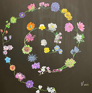 This is entitled “Floris I”. Oil on Black Gesso Canvas. 60 x 60 in. (5 x 5 ft.). This painting took me exactly a month to complete. As you know, I absolutely love flowers and have painted them in all levels of abstraction to realism. This is my most realistic portrayal of flowers but at the same time the arrangement is entirely unrealistic and fanciful. Painting realistic flowers on a table, for example, is more classical but a bit boring to me. Painting them realistically but in an unusual arrangement adds visual intrigue and renders the design modern. I will be making a similar one “Floris II” for a charity.
 -
 This is entitled “Halo” and is a color-pencil painting on 16 x 20” sanded white paper. It features my wife Ellie and child Alessandra. I replaced Alessandra’s face with a more recent photograph because she has a better expression in the newer photograph.
 -
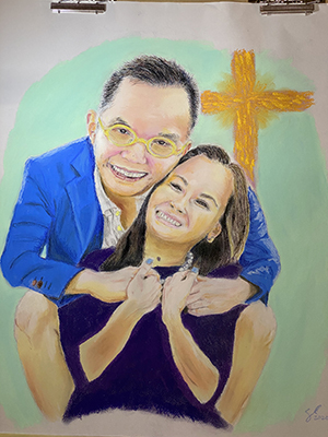 This painting is entitled “Together Through This” (Pastel on 22 x 19” Toned Gray Paper). This pandemic tragedy brought my wife and me closer together knowing that we rely on each other to get through these tough times, fully recognizing how blessed we are already and continue to be. We are also together with our Lord who is always with us, as represented in this painting. My faith is helping me cope with where we are. If you don’t have a faith, I would love to share with you what has given me hope and joy.
 -
 This painting is entitled “Dreams of Eze”. It is a soft pastel on 24 x 16” hot-press watercolor paper and it is dedicated to my dad (see below). It represents a radical departure for me from my previous work that attempted to achieve more realistic renderings. It is inspired by the Impressionist, Post-Impressionist, and Fauvist movements. You can see boldly imagined impasto strokes, rough smears, exposed paper, and unrealistic colors. Sorry the colors in these photos look nothing like the original. It is also a memento to my father who painted Impressionist landscapes and figures with pastels. I hope he likes this painting from heaven. (I know he does! Miss you dad.). As we stay locked shelter in place, I dream of the time Ellie and I traveled to her favorite French Riviera town, Eze, where I brashly claimed I had been and we didn’t need to go because I studied French when I was in college in Provence. Well, I actually totally missed that city and went to the neighboring village Eze-Sur-Mer, which is nothing like it. Eze is an elevated medieval city filled with trellised gardens, cobblestoned streets, and magnificent views of the ocean. As you can see, I have reimagined parts of this painting with French Riviera flora as compared with the dry landscape of the original reference photo. I love color and love Matisse. Ellie’s dress is an homage to some of Matisse’s dress patterns. Also, the hotel where the movie Bucket List was filmed was where we stayed: Chèvre D’Or. Our bathroom was carved into the side of the mountain. I hope you enjoy your travel to southern France with me!
 -
 This painting is entitled “Sunrise over Santorini” and is a soft pastel on 22 x 30” hotpress watercolor paper. This painting incorporates Impressionist, Post-Impressionist, and contemporary styles (inadvertently Hockney) using extremely bright, saturated colors that do not necessarily reflect reality but captures the imagination. I used no fine pastel pencils, only rough and saturated soft pastels. This painting continues my fantasy travel series during this Covid crisis. Santorini is one of my favorite places in the world, and this painting was based on our time at Astra Suites in Thira, in the center of the Santorini crater. As you can see from the reference photos, I moved the painting from sunset to sunrise to express the brighter colors. I also combined two photos into one so that I could capture the central peak and the two flanking curves of the crater in one image. Further, I moved the sun over compositionally to the left for better aesthetic balance. When we were there, in the morning we would have breakfast made to order on our balcony looking over the morning fog that settled over the craggy peaks. What a memory. I hope you enjoy these travels together!
 -
 This painting entitled “Ma Petite Ange” is my first attempt at doing an ink and wash painting, which was done on 10 x 14” cold-press fine-grain watercolor paper. I replaced Alessandra’s head with a still from a video since the original photo was taken about 6 months ago and I wanted to update her head. This is the first time I’ve been able to use my 108 set of Holbein watercolor paints from Japan, and they are magnificent!
 -
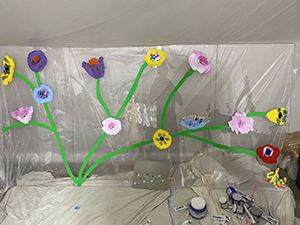 This is the largest painting I’ve done 4’ x 16’ entitled “Spring Returns”, and it is an acrylic painting on clear acrylic panels. The title alludes to the Spring time we are currently in, our Spring that will return when this Covid crisis is over, and of course the flowers in the painting. It will be mounted floating in front of a limestone facade at the main entry of our wellness building when you walk in. As everyone knows, I love flowers and they cheer me up! Hope it cheers you up! I can’t show the painting as one piece because the painting is too long horizontally.
 -
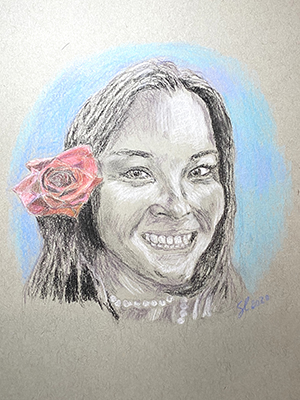 This drawing is entitled “Bolero” and is a charcoal and color pencil on 9 x 12” tone-gray paper. The title comes from a Spanish dance, and the rose in Ellie’s hair somehow reminds me of a Spanish dancer. This is a first attempt for me with charcoal, and I found it to be a wonderfully expressive medium. Using white charcoal and tone-gray paper was a lot of fun! As you know, I simply have a hard time escaping my desire for some color, so I was planning all along to add the splash of color to the rose. Initially, I was thinking about using pastel, my favorite medium, but the chroma on the red would have overpowered the drawing. I was then going to use charcoal willow sticks for the background but I decided it would have swallowed the facial features, so I went with shades of baby blue with darker tones near the lighter highlighted hair. The blue also complements the red rose and balances the drawing. Also, as you can see I can’t escape my passion for portraits and flowers. This drawing allowed me to combine my two passions into one subject. Hope you like it!
 -
 This drawing is entitled “Faith Hope Love” and features my parents. It is a charcoal and color pencil on 9 x 12” toned-gray paper. This is my second attempt at charcoal work, and I love it!
 -
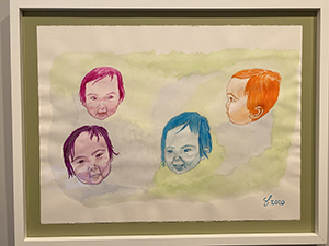 Happy New Year from the New Year baby, Alessandra! It is entitled “Happy” and it is a watercolor, gouache, and color pencil on 30”x 22” cold-press watercolor paper.
 -
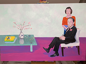 This painting is entitled “Double Portrait” and features my mom and dad. It is an acrylic painting on 6 x 4 feet canvas. It is my most ambitious painting to date and represents my first attempt at an acrylic portrait, very difficult considering the incredibly fast dry time but I liked the challenge. The painting is inspired by David Hockney’s 1971 painting of Sir David Webster which was of a similar size, color palette, and medium (see attached). In fact, I copied his table as an homage to the artist and his work. As you can see on the table there are three books. All books may or may not exist in reality but they do in my imagination. The first book is on Hockney’s double portraits, of which he is famous and which is why I entitled this painting double portrait. The cover features his famous Portrait of an Artist that sold for $90 million making him the most expensive living artist until he was eclipsed by Jeff Koons at $91 million. The painting on the cover of the book features a swimming pool and with my Santorini painting that had a swimming pool in it I was inspired to explore Hockney more in depth, which inspired this painting. The second book on the table entitled Museums of Naoshima references museums that I really want to see on a small island in southern Japan near my mother-in-law Masako’s home island of Shikoku and the book is an allusion to her. The bottom book on the Chèvre D’Or hotel in Eze is a stand in for my wife Ellie and also a reference to my previous painting on the same subject. The cross in the center of the painting represents the centrality of Christ in my life. The Sakura (cherry blossom) flowers represent my daughter (her middle name), and the same flower is in my dad’s handkerchief. The flowers are situated in a Ming vase, which represents my Chinese heritage. It also features two birds that my wife wanted me to paint, which represents us. The style of the painting is a mixture of realism and expressionism, the latter of which is especially expressed in the skin tones and facial features.
 -
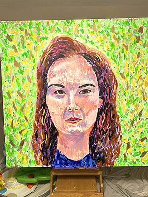 This painting is entitled “Shine On” and it is an acrylic on 5 x 5 feet canvas. The title has three meanings: the expression means to carry on and it refers to our ability during the Covid crisis to Shine On; it refers to one of Ellie’s (and my) favorite artists, Pink Floyd; and it refers to the sheer brilliance of colors including the use of bronze, copper, silver, and gold, along with violet and orange interference paints (the latter of which you can’t even see in this photo). This painting will be over my fireplace and you first approach it from 90 degrees down a long hallway. There is direct sunlight on it, and all you will see at first are these brilliant sparkles from an angle! This painting looks amazing in real life, but this photo capture 1% of the beauty of the original painting. The painting process required expanding and shrinking brush strokes, adjusting colors, and altering color values. It was a fun and truly challenging process.
 -
 This painting is entitled “Birds of Paradise” and is an acrylic painting on 6 x 6 foot canvas. This is the largest canvas that I’ve done these past few months, and it is so large that I couldn’t bring it upstairs to my art room and mount it on my easel, so I had to paint parts of it lying on my side on the floor. The painting combines an impressionist-style landscape with a realistic foreground consisting of birds, window, table, and vase. The title of the painting refers to the name of the flowers and the birds, of course. The vase also has a bird and flowers on it. The surreal painting will be the centerpiece of my dining room.
 -
 This painting is entitled “The Dance”. It is an acrylic on an 8 x 3 foot canvas. It is the tallest painting that I’ve ever done and it has taken me the longest time, a little over a week, that I have worked on a single painting. It is so tall that I had to use a ladder to paint the upper half of the painting. The title and concept are based on Matisse’s “The Dance”, which is featured on the right side. The vase of flowers and the angle of the painting are taken from one version that Matisse did with a vase of flowers with his painting of the Dance as an element within his painting, so my painting is a painting of painting within a painting. This painting will be at the end of a long hallway leading to my bedroom. I chose the jumping dancer as the focal point to fill this vertical frame. If you see, the perspective of the painting is also from an elevated vantage looking down as if you the viewer are also dancing in mid-air. I painted my wife’s face onto the pose of a dancer. I wanted the stillness and solemnity of my dog Kumo to anchor the bottom half of the painting.
 -
 This painting is entitled “Solitude in Santorini” and is an acrylic painting on 4 x 4 foot canvas. The idea came from Ellie wanting more abstract pieces for the home and my inability to escape figurative paintings. I thought that making 90% of the canvas filled with simple blues would appeal to her and fortunately she agreed to it. This painting is a sequel to my pastel “Sunrise in Santorini” and both feature Ellie in the pool at our hotel Astra Suites located in Imerovigli in Santorini looking right over the center of the crater facing the volcanic cliffs, the three peaks which you can see in the misty background. I used ultramarine blue, light ultramarine blue, and white for the sky, deep cerulean blue and white for the sea and the volcanoes, light phthalo green, light phthalo blue, white, and brilliant blue for the pool. The wall is a mixture of primary cyan, anthroquinine blue, and white. The shadow in the pool is composed of light phthalo blue and green, brilliant blue, white, and dioxazine purple. I transitioned from dark to light then light to dark from top to bottom and from blue to green and green to blue in the colors.
 -
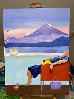 This work is entitled “The Long Journey” and is an acrylic painting on a 4 x 3 foot canvas. Ellie is shown after a long day of travel returning back to the hotel with a view of Mount Fuji. This is an imagined scene since I don’t recall ever staying in a hotel facing Mt. Fuji. It continues my themes of travel, Japan, and a split frame divided 50/50 like the last one of Ellie in a pool in Santorini facing the ocean. I love the colors of Mt. Fuji. I could look at that part of the painting for hours! The partially truncated head has multiple intentions. First, it shocks the viewer and frames the painting in a very unique way. Second, I was really inspired by an interview with the artist Cecily Brown who said that the face defines the narrative of the painting and overly dominates the painting (which is absolutely true), so by partially obscuring it the painting removes that element. Third, it’s a figurative statement that the mind is wiped out after a long day of travel. The open guide book set on the lap further symbolizes mental fatigue. The items in the room symbolize femininity like the purse, peaches, and shoes not to mention the swooning appearance. This is contrasted against the masculine presence of the mountain, which also has a feminine loveliness to it as well. There is a lightness to the upper half of the frame and heaviness to the lower half that provides another interesting contrast. The peaches also symbolize Japanese-ness, longevity, and truth. This painting will go in the hallway upstairs.
 -
 This work entitled “Big Rock Candy Mountain” is on two canvases of 5 x 5 feet making it 5 x 10 feet in total. This painting has morphed so many times and has finally landed as a bright and massive painting for Alessandra’s future nursery. The title is from the folksy joke song that Ellie loves to sing and reminds her of where she was born in northern Georgia/Tennessee. Of course, also these bright and stylized mountains look like big candies and hopefully will make her room tasty and joyous! I used almost half of my 16 oz. jar of titanium white to make the colors more pastel and muted, especially in the background where it is more distant and misty. Hope you enjoy this playful painting!
 -
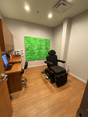 This colorful painting was done in acrylic and meant to evoke the beauty of cherry blossoms on a bright Spring background. It was inspired like many in this series from textile prints.
 -
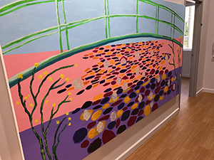 This is 5’x9’ oil & acrylic on canvas entitled “Giverny”, my first oil painting and largest canvas I’ve done. It is obviously inspired by my visit to Monet’s lovely garden a few months ago in August followed a week later by my visit to the Kimball to see Monet’s later years, a truly awe-inspiring exhibit. This is the farthest I’ve delved into representational art but I can’t escape some of my roots in abstraction, which is mainly exemplified here through the color scheme. The background, Japanese bridge, and water flowers were done in acrylic followed by the water lillies and trees in oil. I have included some details of the painting since it is near impossible to appreciate it on a mobile device.
 -
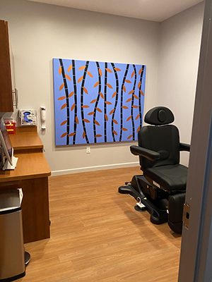 This bamboo painting with copper leaves follows my passion for textile art and is highly stylized with a very flat look. It is located in the new expansion of my clinic.
 -
 This tall acrylic painting evokes a starry night with a lot of stylized lines and dots that do not have much visual meaning other than bearing their artistic value.
 -
 This diptych in acrylic represents dawn and dust from left to right and looks also like a rainbow.
 -
 This painting is entitled “Love” and features my wife Ellie and daughter Alessandra. It is a watercolor, gouache, and color pencil on a 30” x 22” cold-press watercolor paper.
 -
 This tetraptych is entitled “Family Portrait” and is pastel on 12 x 16” sanded color paper.
 -
 This acrylic painting is entitled “The Aviary” and inspired by fascination with textile design.
 -
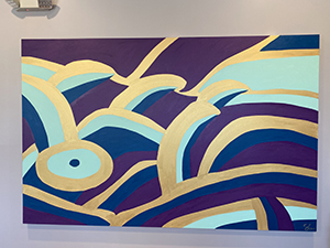 This acrylic painting is inspired by the famous Japanese woodblock print entitled “The Great Wave off Kanagawa” by Japanese ukiyo-e artist Hokusai.
 -
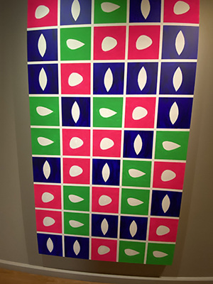 This acrylic painting is inspired by Matisse’s cutouts he did later in his life.
 -
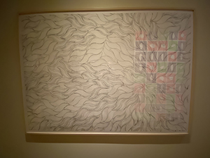 This drawing was done with graphite and uses the organic leaf motif seen in the previous painting above.
 -
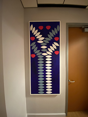 This acrylic painting continues the leaf motif and here they are used to create an abstract fruit tree.
 -
 A larger leaf motif painting with my favorite bright colors.
 -
 This 22 x 30” watercolor is entitled “Hug” and features my wife Ellie and my dog Kumo. The challenge was getting the dog fur looking good. It took me awhile to make that look pleasing to my eye. I like the vertical orientation and the use of negative space here. The colors really look much more striking in person.
 -
 This painting/drawing is entitled “Wonder” and features my daughter. It is a graphite and watercolor on 30 x 22” hot-press watercolor paper.
 -
 This piece is entitled “Radiant” and is graphite pencil and watercolor on 30 x 22” hot-press watercolor paper. It was taken just before our wedding on the beach in 2016.
 -
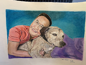 This color pencil on paper measures 30 x 22” and is entitled “Best Buddy” and features me and my dog Kumo.
 -
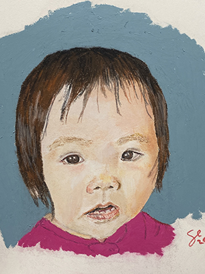 This pastel on sanded paper is entitled “Joy” and features my baby Alessandra.
 -
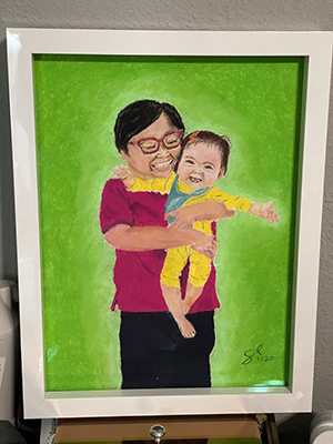 This is a pastel on paper and it is based on the photo of my mother-in-law Masako and my daughter Alessandra taken after we visited the Monet exhibit at the Kimbell Art Museum.
 -
 This painting entitled “Les Fauves” (6’ x 4’ Acrylic on Unprimed Canvas) was inspired by an exhibit that I saw in Tokyo of Raoul Dufy’s work on his textile designs. As you probably know, Dufy was known for his participation in the Fauvism movement (one of my favorites), which was known for its bright colors and abstracted style. Also I’ve been inspired by one of my favorite artists Morris Louis who was renowned for his “stained” paintings in the 1950s. This follows that style. I used airbrush and solid acrylics thinned and extended with GAC airbrush extender that allows it to soak into the unprimed canvas. I used different gradations of the paint to simulate a watercolor or stained look. Like watercolor, this technique is difficult because any mistake cannot be corrected: one drip, one drop, or one stroke out of place is unfixable.
 -
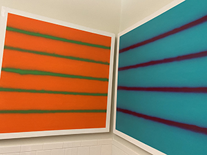 This acrylic diptych is done with spray paint and is inspired by the artist Agnes Martin.
 -
 This is a large watercolor triptych I did for my new office expansion.
 -
 This 30” x 22” watercolor, gouache, and color pencil painting on cold-press watercolor paper is entitled “Family” and features my mom, dad, and baby Alessandra.
 -
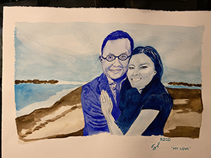 This 30 x 22” watercolor is entitled “My Love” and was rescued from the brink of disaster. There is a gouge and a tear on the paper near my right ear, Ellie’s eyes were messed up, and the watercolor bled uncontrollably. I was depressed and was going to chuck the whole thing. I knew that if I could save Ellie’s eyes and make them look good this watercolor had a fighting chance. I used a white gel ink pen to reshape the eye and a dark blue color pen until I saw her identity return. I then fixed the skin tones, fixed the hair and the dress, and then used a darker shade of blue to cover the deepest part of the tear that corresponded to the top of my ear and did a darker shade of sky over the tear then lightened the tear with gouache. Not perfect but pretty good. This was taken right before our wedding in Cabo on the beach. Great memory!